
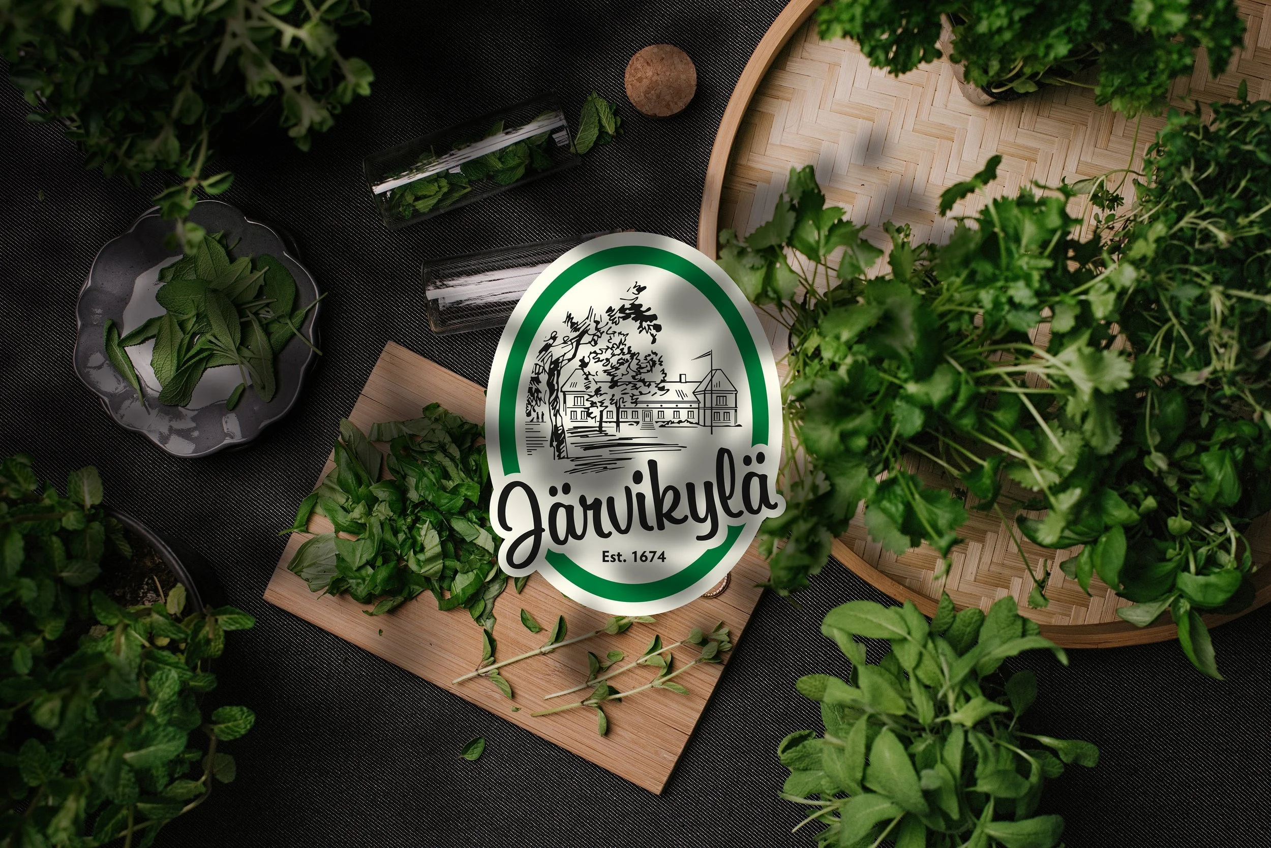
Järvikylä is one of the biggest producer of fresh herbs and salads in Finland. As Järvikylä was changing their plastic pots to a biodegradable alternative, they also wanted to update their brand. Järvikylä asked Tony to help them in developing their new look and brand communication.
Our approach to the design was to find ways how to highlight Järvikyläs interesting history and heritage. We wanted to refresh the look of the brand by redesigning the iconic logo to work in one color and the logotype to be more readable in a smaller size. Additionally, the logo was updated with a more clearer illustration of the historic Järvikylä mansion. We also added the new family-owners of the company to the illustration to communicate a new era.
As for the packaging design, the updated logo plays a big role in communicating the main story behind the brand. In product communication, we updated the product typography with new clearer fonts to help the consumer to find the products easier. As for communicating the family-owned business we decided to use ”kasvatettu sinulle” sentence underneath the product name. By this, it communicates that Järvikylä has grown the product for you, which gives a warmer approach towards the company. Additional improvements were to change the packaging color from a greener to a more white to highlight the green fresh products inside. Altogether we designed over 60 SKU’s and additional shipping and display packaging in a very limited time-frame.