Aarrearkku
Brand development:
Brand concept
Research & Insight
Product design
Visual Identity
Illustration
Communication
Packaging Design
Rediscovering a Classic Treasure
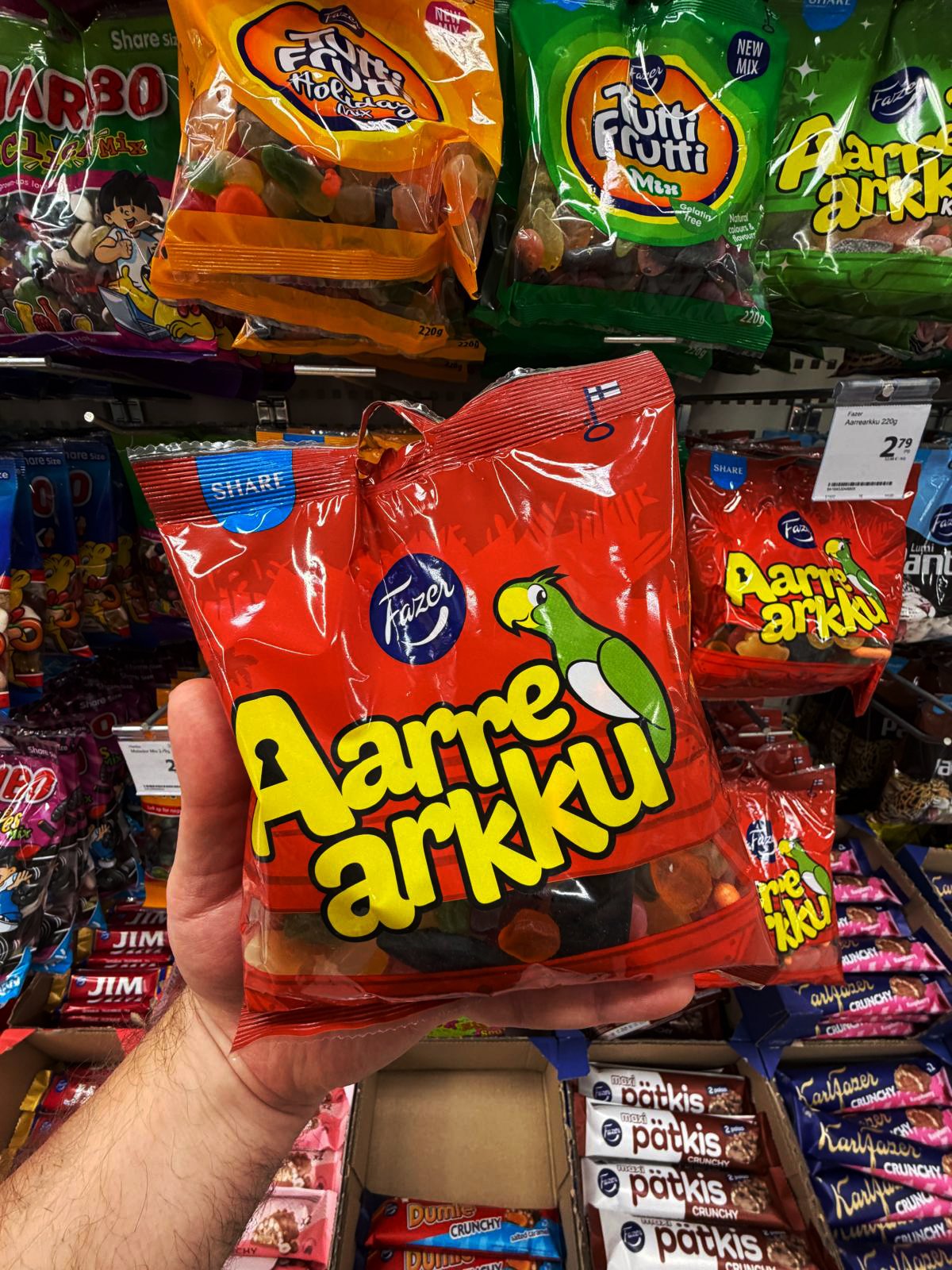
Fazer’s Aarrearkku, meaning “Treasure Chest,” is a much-loved Finnish classic that has delighted generations with its playful spirit and sense of discovery. Over time, however, the brand’s visual identity had lost impact, and its story no longer resonated with younger audiences, and sales had also begun to decline. These challenges made it that Aarrearkku needed a change.
The challenge was to balance heritage and renewal. We needed to preserve the nostalgic elements that loyal fans recognised while refreshing the design and narrative to attract new families and children. The aim was to rediscover the heart of Aarrearkku’s treasure theme and bring it to life through a clearer story, stronger shelf presence and an updated identity that felt both timeless and playful.

Approach
We set out to make the Aarrearkku story relevant for today’s children while keeping its nostalgic charm alive for adults. Our first step was to study the brand’s history, analysing past packaging, colour palettes and character design to identify which elements carried the most recognition and emotional value.
Research showed that Aarrearkku’s greatest strength lay in its colours and visuals. The parrot mascot and treasure chest were iconic but needed modernising to feel fresh and engaging. At the same time, the product’s could play a stronger role in reinforcing the treasure theme.
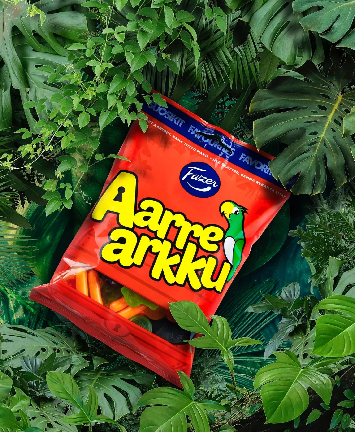
Our strategy was to amplify the sense of adventure while bringing visual clarity and warmth to the design. The goal was to make each purchase feel like a small treasure waiting to be opened. The result was a playful and curious brand that celebrates surprise and shared joy across generations, confidently blending nostalgia with imagination.

Concept & Visual Identity
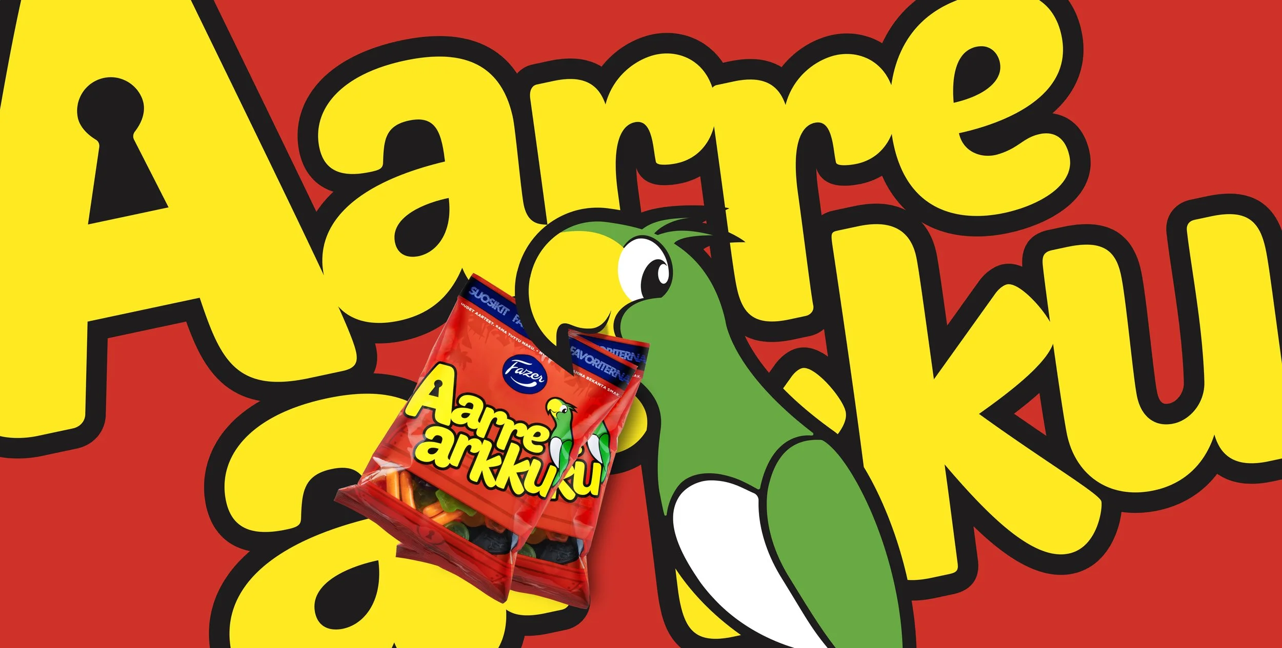
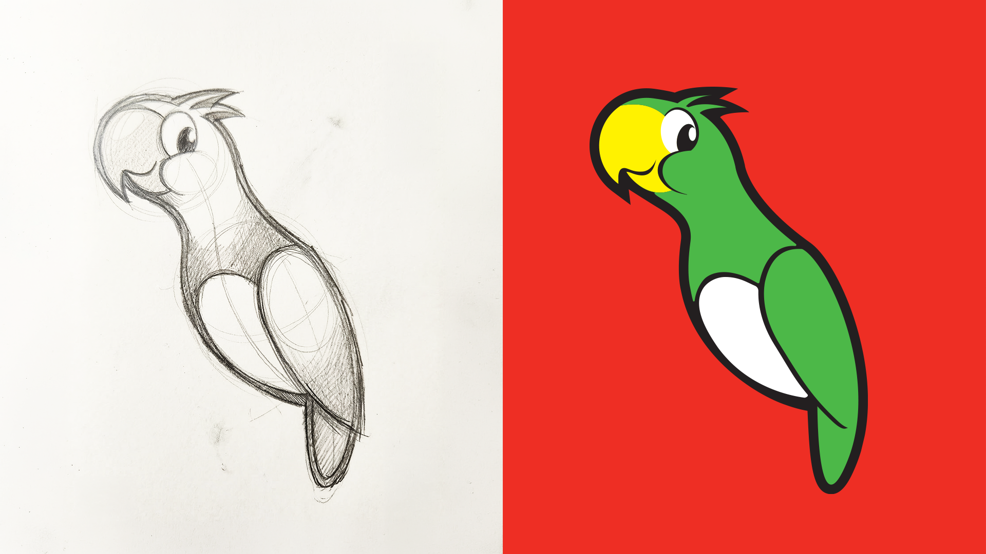
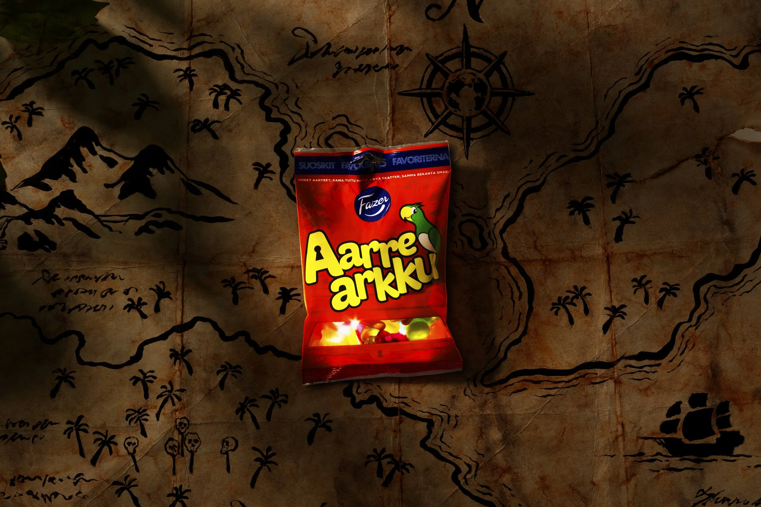
We started by refining the brand’s most recognisable assets. The parrot, a long-time mascot, was given a cleaner, more dynamic illustration style and a friendlier personality. Its form was simplified and made more active to connect better with children. One key element of the redesign was improving the parrot’s “eye contact” with the consumer, so its gaze now feels more direct and engaging.
The logotype was redrawn to improve legibility and to create a more cohesive relationship with the rest of the design. The treasure chest itself, once the dominant feature, was blended into the background to give more prominence to the parrot and the name. This change made the overall design lighter and more focused.
To deepen the storytelling, we also introduced five new candy shapes — jewels, coins and even a small “treasure key” — each designed to tie back to the adventure theme and make the unboxing experience more engaging for children.
Results
The refreshed Aarrearkku concept successfully revitalised a beloved classic while proving its potential for renewed growth. Initial feedback was really positive.
The updated character design and simplified packaging helped Aarrearkku reclaim shelf presence, appealing to both nostalgic adults and curious children. The new candy shapes added a tactile layer of discovery that deepened the brand’s story.
As a design and concept development project, Aarrearkku demonstrated how an iconic product can be renewed with care and creativity. By focusing on storytelling, emotion and simplicity, Aarrearkku was rediscovered by a new generation of explorers.