

Lontoo rae
Brand development:
Brand concept
Research & Insight
Visual Identity
Illustration
Communication
Packaging Design
A classic reimagined with British charm
Fazer is one of Finland’s most iconic confectionery houses, known for creating products that have become part of the country’s cultural fabric. Among its classics sits Lontoo Rae, a beloved liquorice and sugar-coated candy that has delighted generations.
Despite its strong legacy, the brand had not been refreshed for years. As consumer expectations and design trends evolved, Fazer recognised the need to renew Lontoo Rae’s identity while preserving its nostalgic appeal. The goal was to reintroduce the brand to modern audiences without losing its charm or recognition.
Challenge & Insight
Lontoo Rae is a much-loved Finnish classic whose name translates to London Drops, referencing the British inspiration that originally defined its identity. Over time, however, many of the brand’s most distinctive visual cues had been lost, and the connection to London had faded. The packaging no longer fully expressed the character, warmth, or heritage that made the product so recognisable.
The challenge was to re-establish this connection in a way that felt authentic and contemporary. The brand needed to balance nostalgia with relevance, strengthening its shelf presence while creating a visual system flexible enough to work across modern packaging and communication touchpoints.
Our exploration began with an in-depth review of the brand’s history and visual DNA. Archival research revealed that London landmarks, particularly Big Ben, had once played a central role in the identity and held strong emotional value for consumers. At the same time, category analysis showed that many heritage confectionery brands had moved towards restrained minimalism, opening up an opportunity for a warmer, more expressive approach.

Concept & Execution
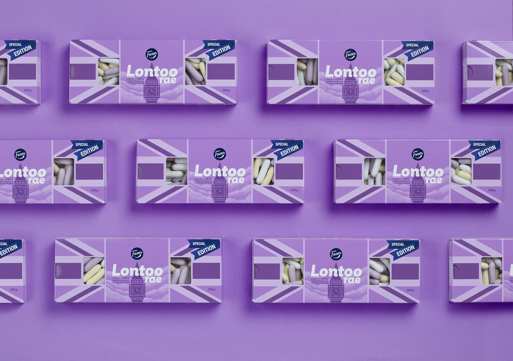
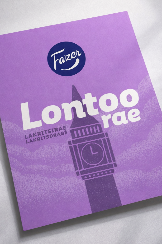
The concept was built around reclaiming Lontoo Rae’s British character and bringing it back with confidence. Big Ben was reintroduced as the key visual anchor, instantly restoring the brand’s connection to its name and origins. The illustration style was reimagined in a contemporary way, allowing the heritage reference to feel fresh rather than nostalgic.
This was complemented by playful “candy rain” elements inspired by London’s famously rainy atmosphere, adding movement, charm and a sense of storytelling to the visual system. Typography and colour were refined to improve clarity and shelf impact while preserving the familiar tone consumers associate with the brand.
The final identity strikes a careful balance between past and present. It celebrates Lontoo Rae’s heritage while giving it renewed energy and confidence, creating a distinctive, flexible system that stands out in the category and reconnects the brand with both loyal fans and new audiences.
Results
The new Lontoo Rae packaging successfully reintroduced a familiar favourite with renewed confidence. Early reactions from consumers and retail partners were positive, noting how the updated design felt both nostalgic and fresh.
The playful “candy rain” illustration became an instantly recognisable feature, strengthening the brand’s personality and making it more adaptable for campaigns and marketing visuals. The refined colours and clearer logo gave Lontoo Rae stronger shelf appeal, helping it stand out while remaining true to Fazer’s design heritage.
As a concept renewal, the project achieved its goal of making an old classic feel alive again. Lontoo Rae now stands as a perfect example of how history and humour can combine to create timeless design with modern relevance.