Ärlig wine
Brand development:
Brand concept
Research & Insight
Communication
Packaging Design
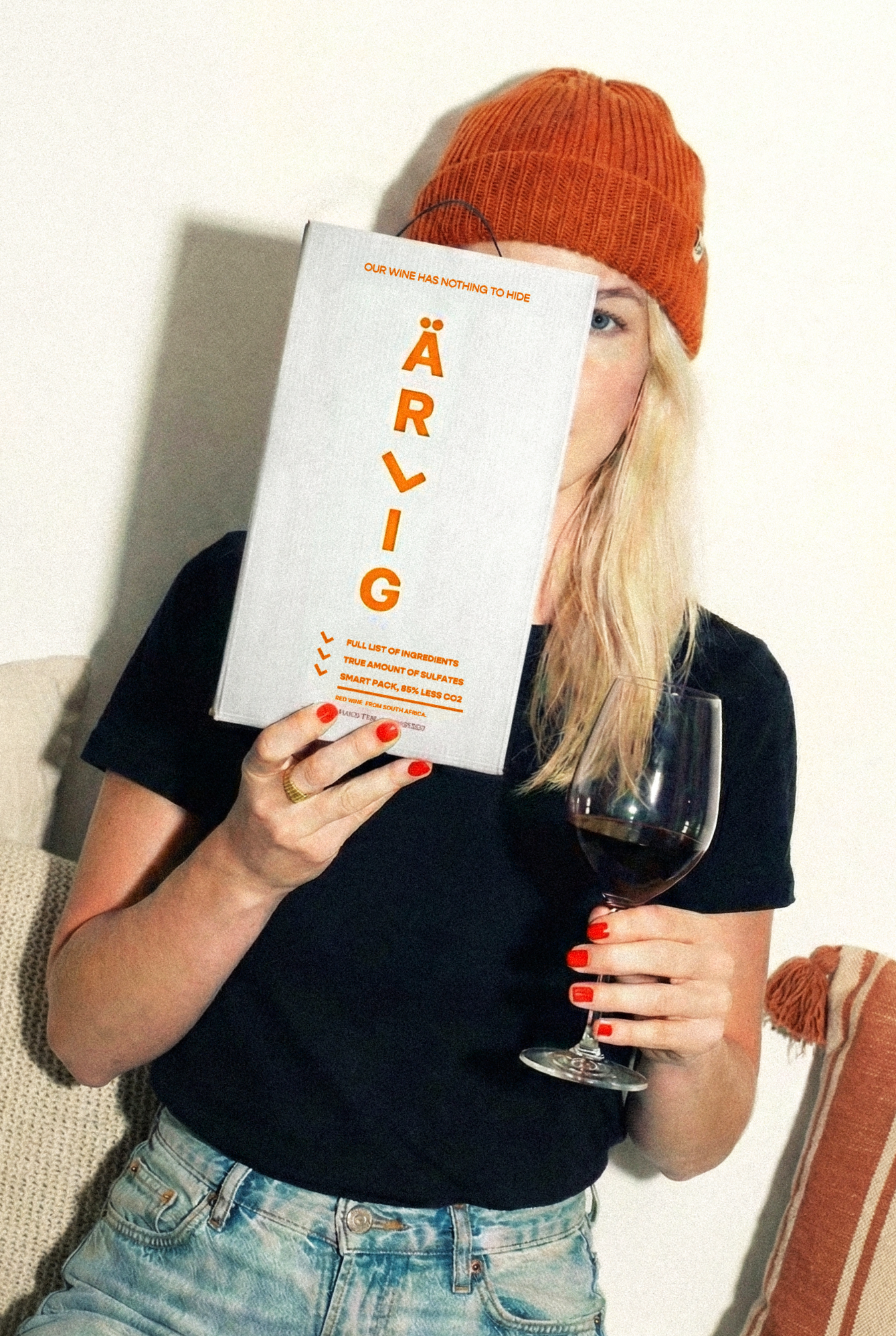
The Simplicity of Being Honest
Domaine Wines set out to create a new wine concept built around a simple yet powerful idea: honesty. They wanted to move away from the ornate storytelling and decorative design typical of wine branding and instead present something refreshingly straightforward and authentic.
The concept, named Ärlig, Swedish for “honest”, was developed for both red and white box wines, aimed at consumers who value honesty and simplicity over embellishment. The goal was to create a brand that felt transparent, and confident.
The challenge was to achieve simplicity without losing warmth or character. In a category filled with rich imagery and layered typography, Ärlig needed to stand apart through clarity and restraint, expressing honesty not as a statement but as a design philosophy.
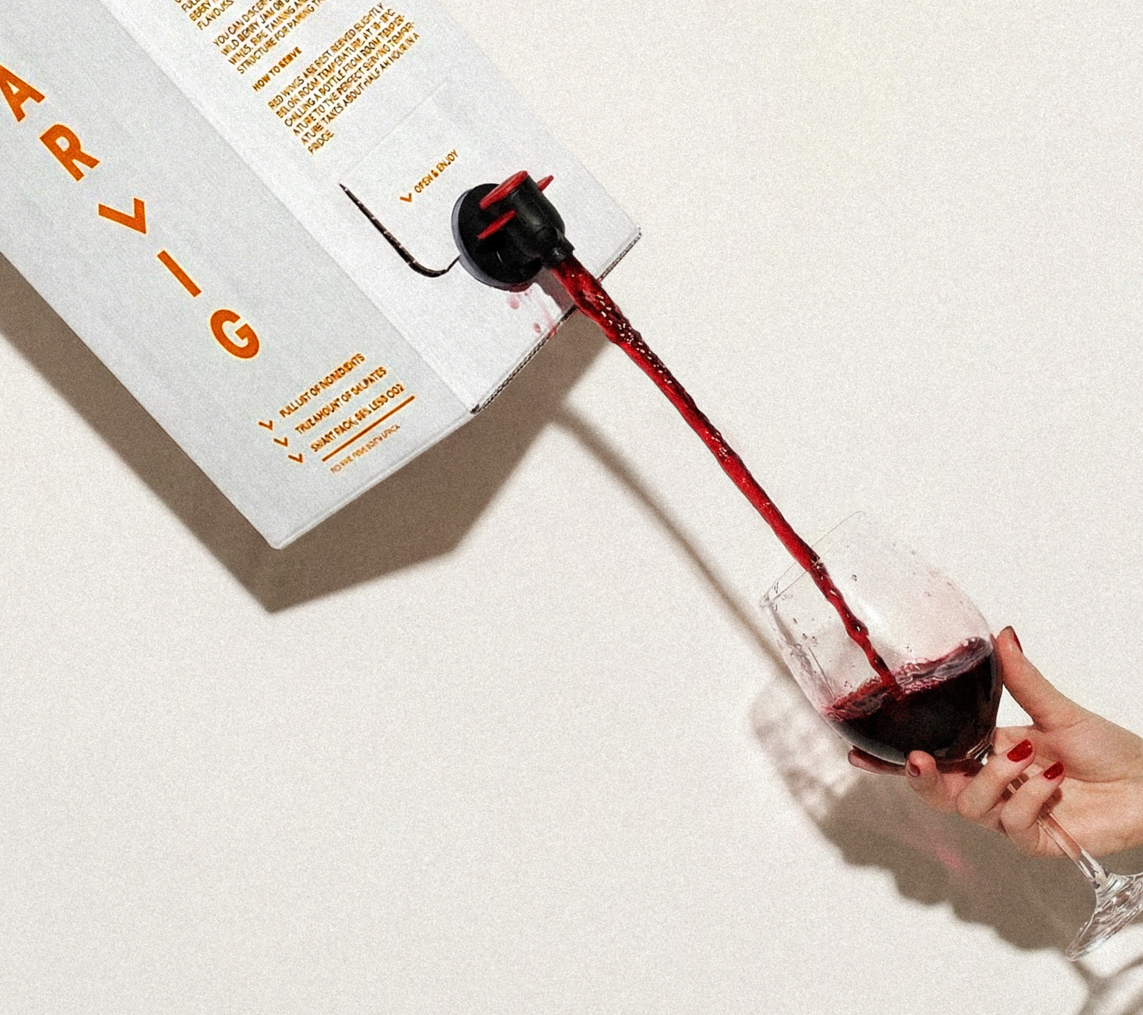
Nothing to hide
We set out to make minimalism feel intentional, not empty. The challenge was to communicate honesty, and trust through design, creating something human and authentic.
Our research began with benchmarking and store checks to understand how box-wine brands expressed value and personality, alongside studying the core customer base, young women, to understand their preferences, expectations and visual cues. Most brands relied on visual noise, layered typography, vivid imagery and elaborate storytelling. This revealed an opportunity: if others were shouting, Ärlig could stand out by just being. Its simplicity would become its signature.
The strategy was to translate honesty into every design and communication. Nothing unnecessary, nothing decorative for its own sake, only essential details, presented with confidence and care. The result is a brand that speaks directly, expressing originality and authenticity.
Concept
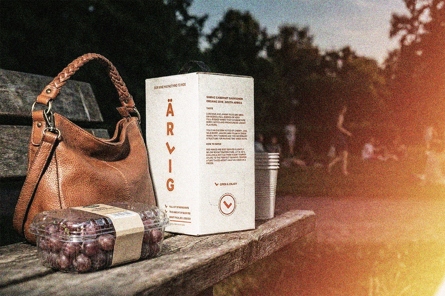
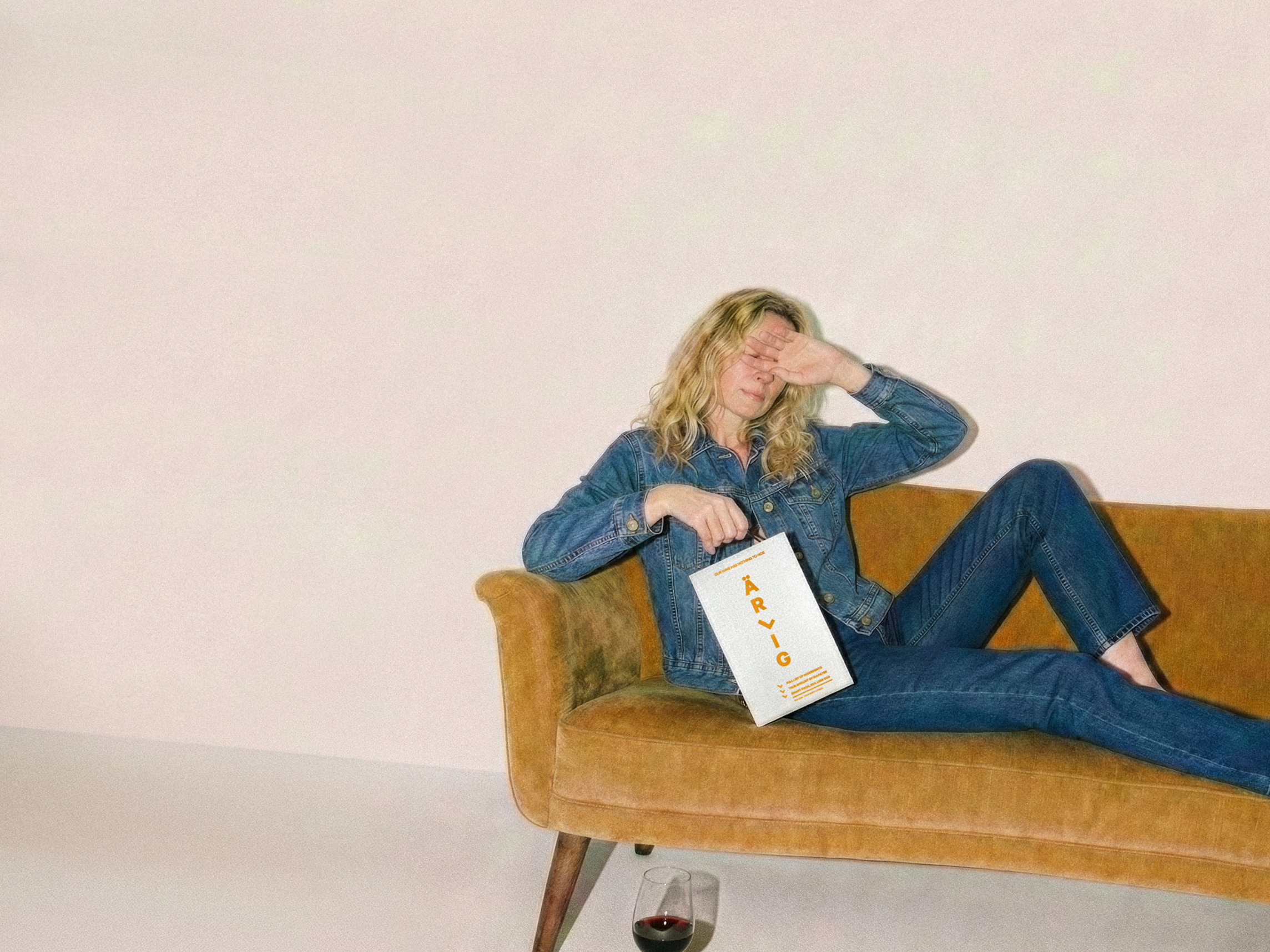
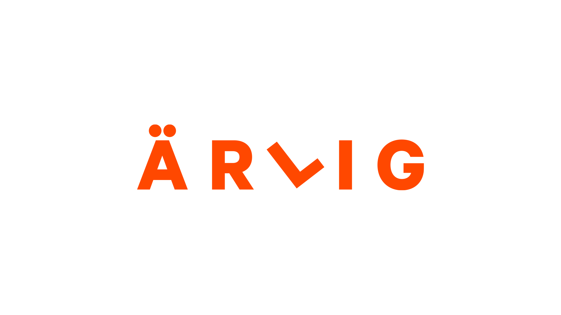
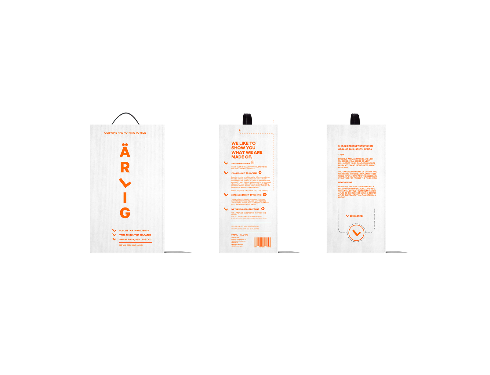
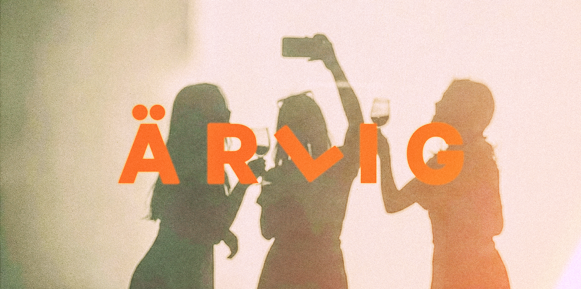
The design concept for Ärlig was built on restraint. The packaging embraces a pared-back layout focused on typography and structure, with the word Ärlig placed boldly at the centre, both a logo and a statement of intent.
A neutral, colour palette mixed with heavy colour allowed the wine to stand out subtly, yet giving the box an authentic, crafted feel. Every design choice mirrors the product’s character: honest, clean and free from excess.
The verbal identity follows the same philosophy. There are no romantic vineyard tales or exaggerated tasting notes, just clear, confident communication that builds trust through simplicity.
The full concept was developed for both red and white variants, ensuring strong shelf presence and clarity at a glance. Supporting visuals, extend the same honest, raw and cohesive aesthetic. Each detail, from typography to visuals, was carefully considered to convey honesty.
Results
Ärlig was developed as a concept to test how an honest and minimal approach could resonate within the boxed wine category. The response from initial presentations and discussions was encouraging. The stripped-back design and transparent storytelling stood out clearly against competitors and stood-out in a saturated market.
The concept demonstrated that there is genuine appetite for a simpler, more authentic expression of quality in the value wine segment. It validated the idea that Scandinavian restraint and straightforward communication can cut through visual noise and build trust quickly.
As a design and strategy exercise, Ärlig provided valuable insight into consumer perception and category differentiation. The project showed that honesty, when expressed through clear design and tone, can be both a creative and commercial advantage — a strong foundation for potential future development.