
Ämy Rock
Brand development:
Brand concept
Research & Insight
Visual Identity
Illustration
Communication
Putting the Spotlight Where It Belongs
Ämyrock is Finland’s longest-running free rock festival — and proudly so. Founded in 1974, the festival has grown into a cultural institution, known for its fiercely independent spirit and commitment to accessibility, ecology, and community over commercial gain.
Held annually in Hämeenlinna, the one-day event brings together established Finnish artists and emerging local acts, creating a platform where credibility matters more than clout and music comes before marketing.
Challenge & Insight
How do you celebrate a legendary festival without turning it into a brand spectacle?
Ämyrock’s core belief is simple: the artists come first.
Not sponsors. Not VIPs. Not the festival itself.
The brief was clear but deceptively complex:
Keep the focus on the performers
Respect the festival’s anti-corporate roots
Create something bold enough for its 45th year without losing its underground credibility
Key insight:
Ämyrock doesn’t need to shout about itself.
It needs to create space for the artists to be heard.
Concept & Execution
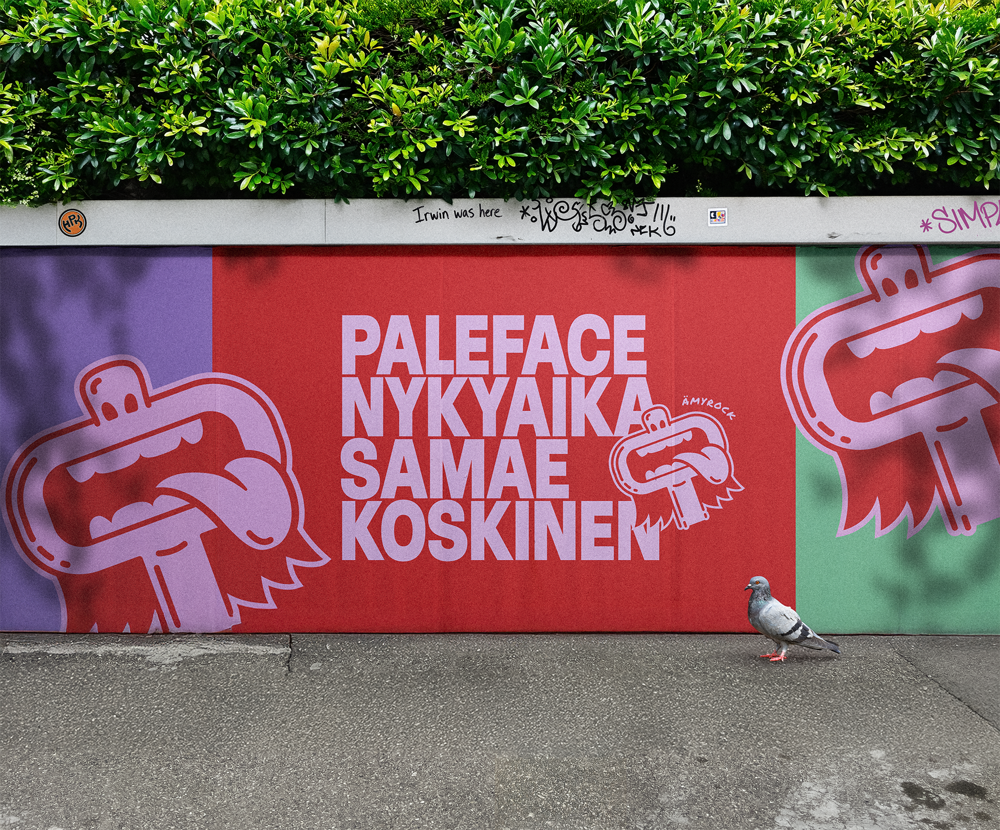
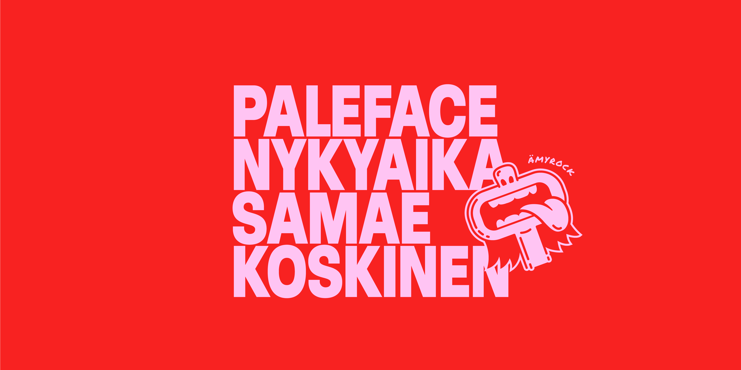
Rather than positioning Ämyrock as the hero, the identity deliberately steps aside to let the artists lead. Oversized artist names form the core of the visual system, reducing traditional hierarchy and shifting focus away from the festival itself. Bold colour fields and hand-drawn illustration reference gig posters and DIY culture, giving the work a raw, human quality.
A recurring mouth motif nods to voice, protest and performance, while the logo remains understated — present, but never dominant. The overall feel is confident without polish, playful without gloss, and intentionally imperfect.
The result is an identity that doesn’t try to sell the festival, but instead creates space for the artists to take centre stage — exactly as Ämyrock has always intended.
Results
The new identity successfully reframed Ämyrock’s 45th anniversary without compromising its anti-commercial ethos. By shifting focus away from the festival and onto the artists, the work reinforced what the event has always stood for, music first, ego last.
The visual system delivered strong cut-through across outdoor placements and social channels, while remaining unmistakably “Ämy” in tone. Audiences and artists alike responded positively to the stripped-back approach, recognising it as an authentic reflection of the festival’s values.
Most importantly, the identity proved that a festival doesn’t need to shout to be heard. By stepping back, Ämyrock’s voice came through louder than ever.