Under construction
〰️
Under construction 〰️
Novita
Brand development:
Brand concept
Product architecture
Research & Insight
Visual Identity
Communication
Packaging Design
Spinning Finnish Heritage brand into a Modern era.
Novita, one of Finland’s most established yarn brands, has been a symbol of craftsmanship and Nordic design since 1928. As the company prepared to expand into new markets such as Sweden and the UK, it needed to modernise its identity and packaging while preserving its rich heritage and connection to nature.
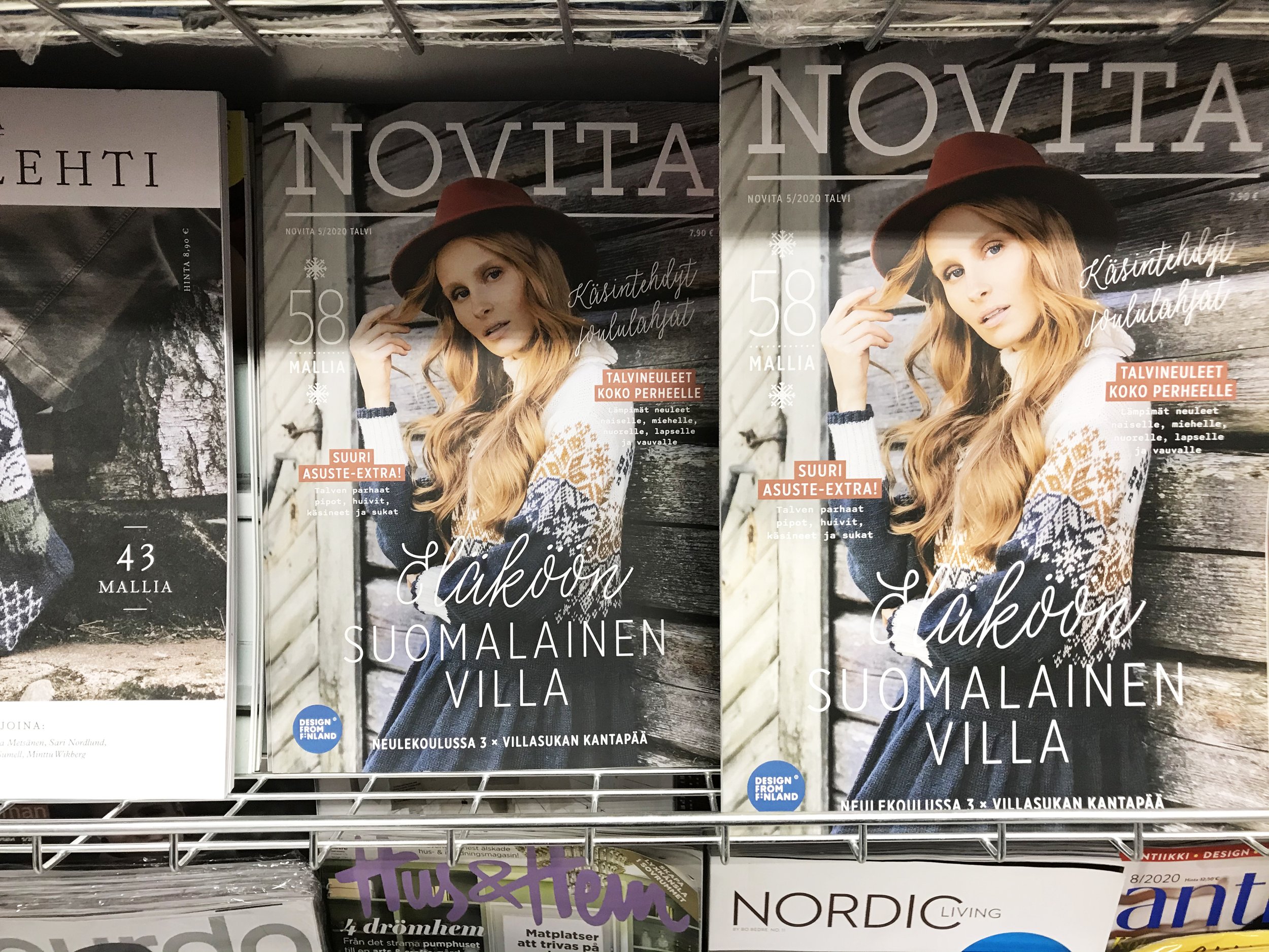
The challenge was to create a unified design system that worked across Novita’s extensive product range. With dozens of yarn types and sub-brands, the previous packaging had become fragmented and difficult to navigate.

Approach
We set out to express Novita’s Finnish heritage in a way that felt modern, international and easy to understand. Research across Finland, Sweden and the UK showed that many yarn brands leaned heavily on nostalgic or decorative design. This gave Novita the chance to stand out through simplicity, honesty and Nordic beauty.
We also identified the need for a clearer product architecture. With such a wide range, consumers needed help navigating the assortment. A structured visual system could bring clarity while strengthening trust and emotional connection.
The result was a clear direction for the brand: a modern expression of Finnish craftsmanship that combines tradition, sustainability and contemporary design. Calm, creative and dependable, Novita celebrates Finnish design values while remaining easy to shop and recognise across markets.
Concept & Visual Identity
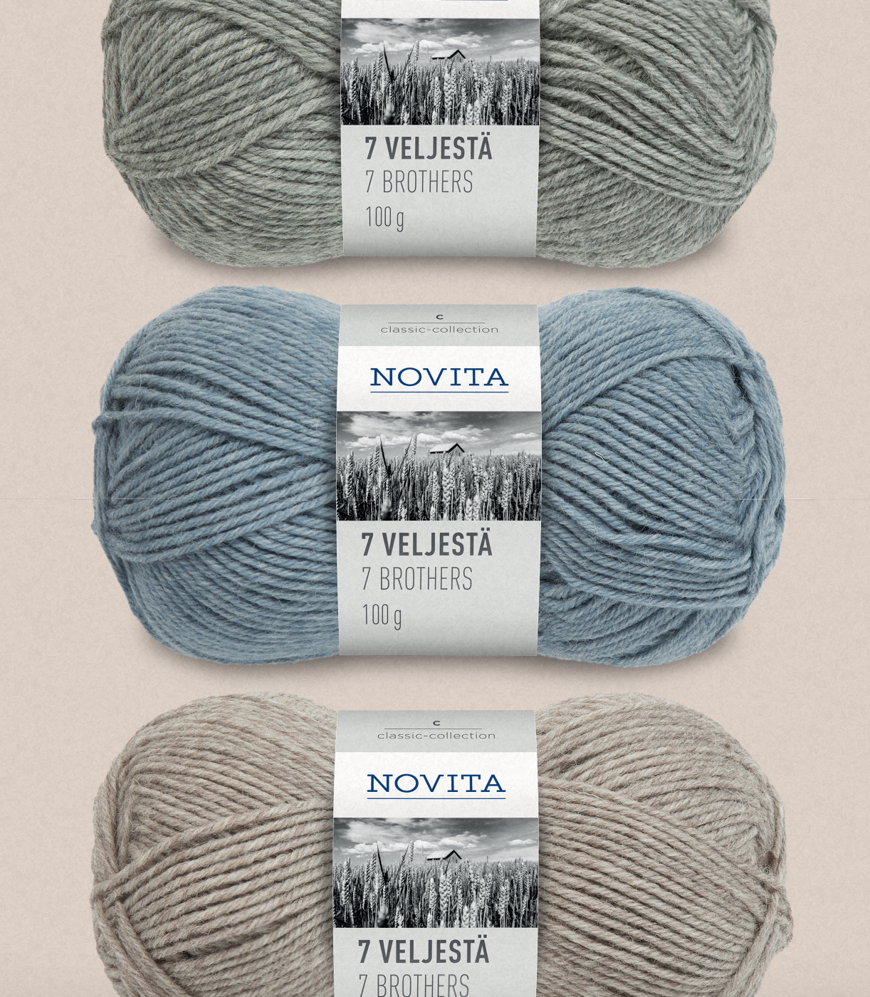
The new visual identity was built around the themes of simplicity, nature and structure. The packaging concept introduced a colour-coded system that divided Novita’s extensive product range into three clear collections: Classic, Seasonal and Natural. This not only brought order to the assortment but also helped customers quickly identify the right yarn for their needs.
Visually, the new design replaced the previously busy layouts and varied illustrations with a cleaner approach. Each package now features a single, evocative photograph representing Finnish nature, design and lifestyle. This image acts as the emotional anchor of the design, giving each product a distinct mood while reinforcing the brand’s Nordic character.
The logotype and typography were refined to enhance legibility and convey understated confidence. The overall design language is calm, structured and elegant, reflecting both craft and clarity.
Results
The new design system gave Novita a clear and confident foundation for international growth. The packaging refresh successfully balanced the brand’s Finnish heritage with a contemporary, European sensibility.
Retailers and consumers responded positively to the new clarity and premium feel. The colour-coded system simplified product selection and strengthened brand recognition across the entire range.
The renewed identity helped Novita enter both the Swedish and UK markets with a consistent, recognisable look that conveyed its craftsmanship and authenticity.
As a strategic and creative collaboration, the project showed how thoughtful design can both organise and elevate a heritage brand, making it ready for new markets while staying true to its roots.