
Under construction
〰️
Under construction 〰️
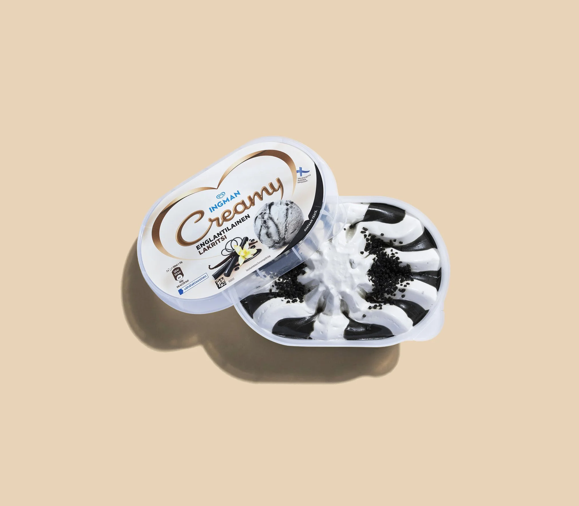
Ingman Creamy
Brand development:
Brand concept
Research & Insight
Visual Identity
Communication
Packaging Design
Collab with: N2
A Heart for Indulgence
Ingman, one of Finland’s most established ice cream brands under the Unilever portfolio, wanted to modernise its well-loved Creamy range for today’s more design-aware consumers. The goal was to refresh the visuals and redefine how the brand expressed indulgence, Finnish origin and emotional warmth in a crowded category.
The challenge was to help Creamy stand out in the freezer aisle while remaining true to Ingman’s trusted heritage. The existing packaging had lost distinctiveness and emotional pull, blending into a market filled with similar promises of indulgence. The brief was to create a modern, heartfelt concept that captured the pleasure of real cream-based ice cream and strengthened Ingman’s identity as a Finnish favourite.
Approach
We set out to understand how Creamy could communicate indulgence in a way that felt modern, authentic and unmistakably Finnish. Research into Nordic and European ice cream brands revealed a category dominated by busy photography and loud colours used to suggest flavour and richness.
Our insight was that true indulgence doesn’t come from excess but from emotion. Creamy could stand apart through simplicity, purity and confidence — a design that feels warm, heartfelt and genuine. Subtle Finnish cues would anchor the brand’s authenticity without overwhelming its modern aesthetic.
This thinking led to a clear direction: a modern expression of Finnish indulgence that celebrates the pure pleasure of real ice cream. The new identity would be warm, sophisticated and emotionally engaging — a design that connects instantly to the heart.

Concept & Visual Identity
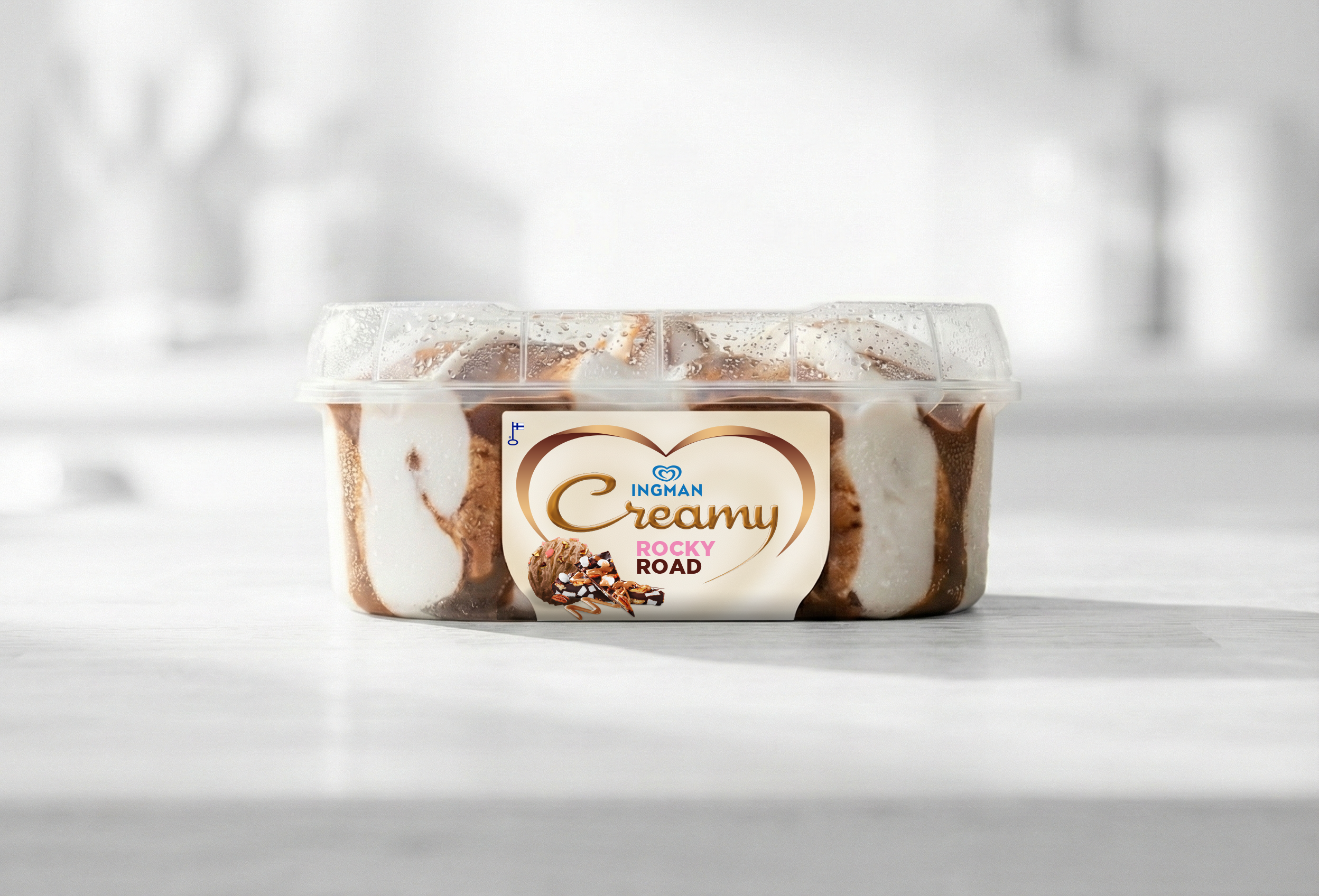
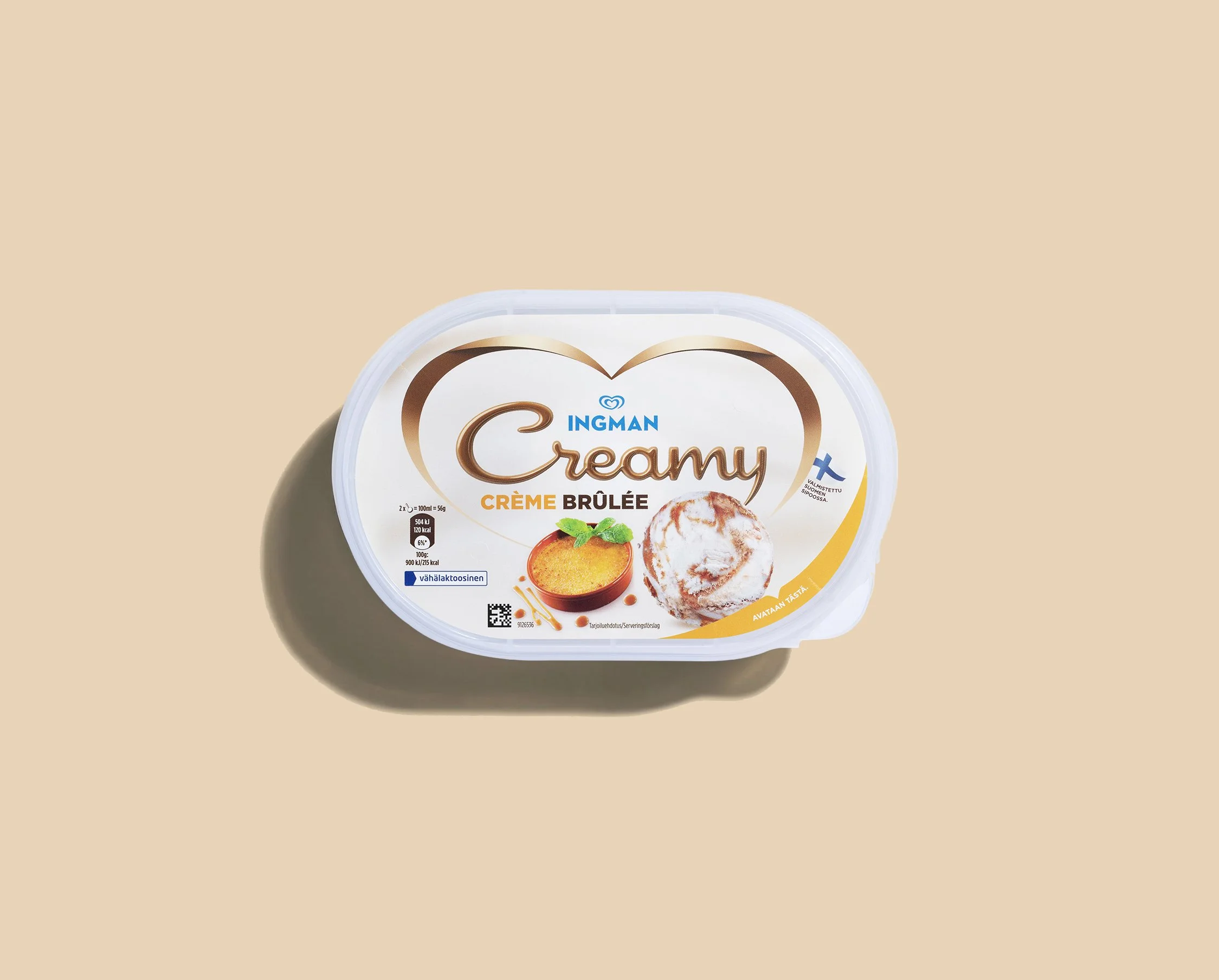
The creative concept was built around a simple but powerful symbol: a heart. This became the central expression of both love for ice cream and the product’s smooth, creamy indulgence.
The heart shape envelops the refreshed Creamy logo, creating a clear hierarchy that first captures emotion, then communicates the brand. The form feels soft, natural and full, mirroring the sensory experience of the product itself.
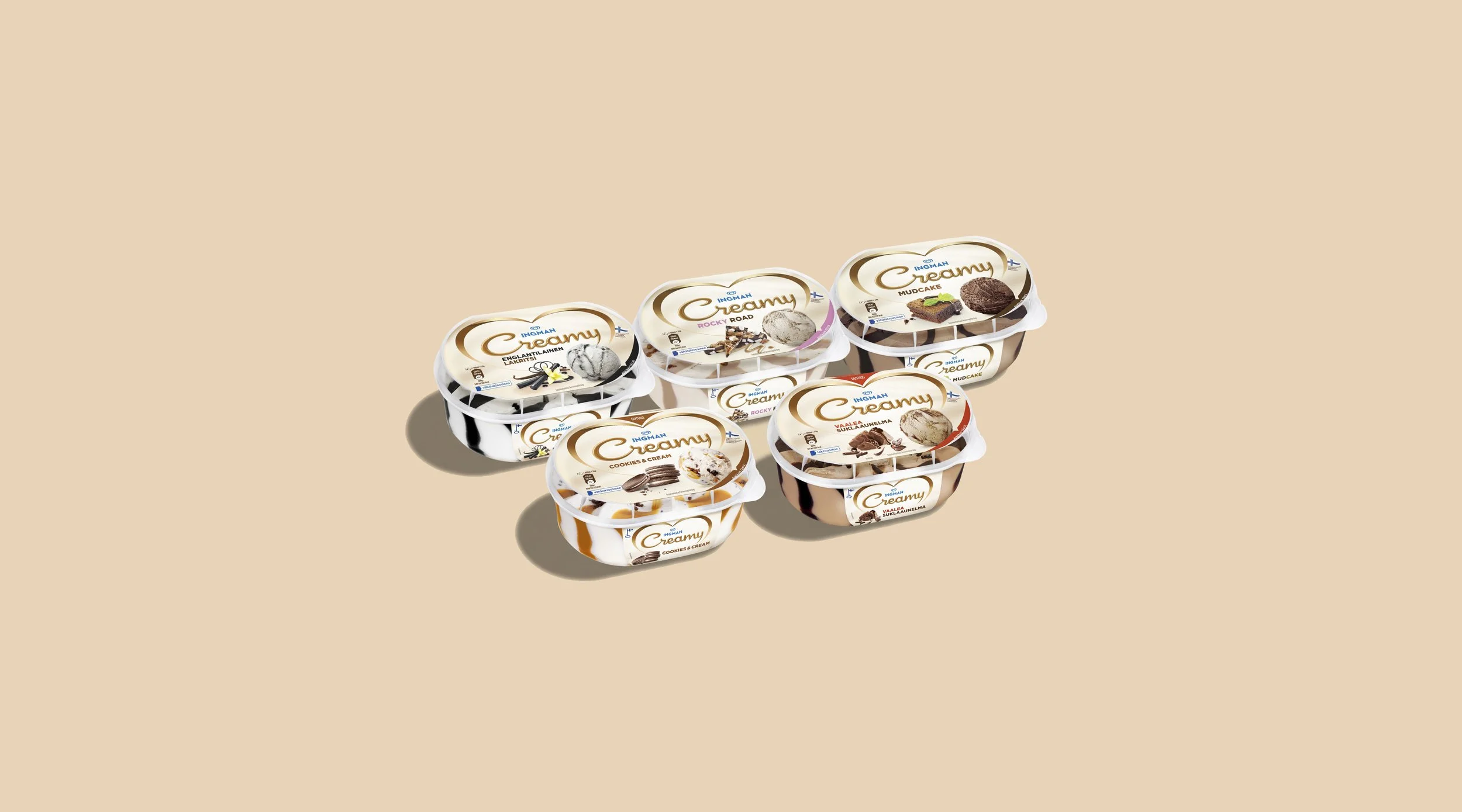
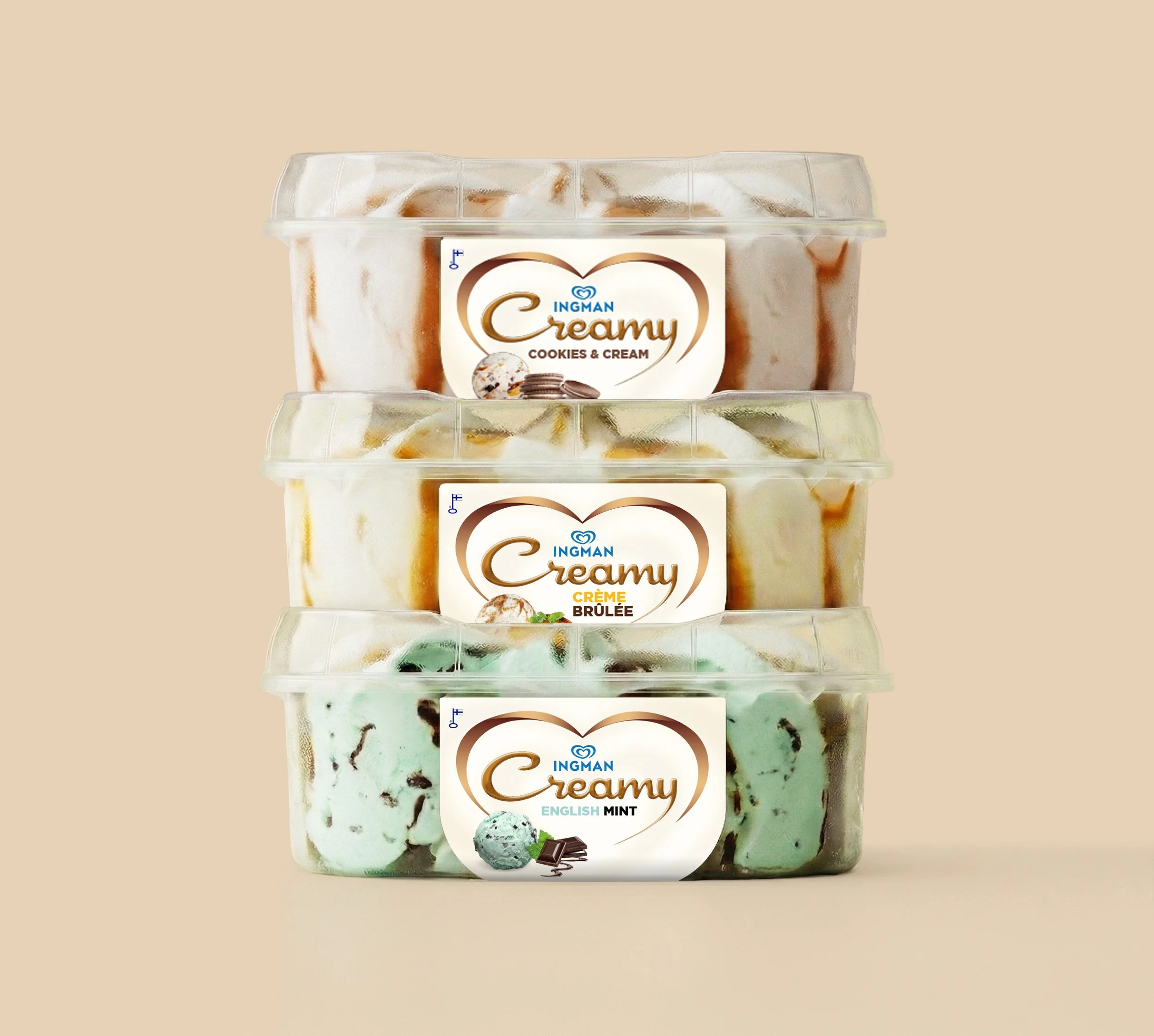
Typography and layout were refined to enhance legibility and elegance, with a visual flow that leads naturally from the heart symbol to the flavour and product imagery. The overall design system balances warmth and clarity, giving Creamy a distinctive new presence in the freezer aisle.
Results
The new Creamy concept revitalised Ingman’s presence in the freezer aisle and successfully reconnected the brand with both loyal fans and a younger audience. Retailers and consumers responded positively to the fresh look and emotional clarity of the design.
The packaging helped the product line stand out amid a visually competitive category and reignited interest in the Ingman brand as a whole. Early sales results indicated stronger shopper engagement and improved brand recognition.
As a creative and strategic exercise, the project demonstrated how the power of emotion, expressed through clear design and meaningful symbolism, can turn a classic product into a modern favourite once again.