WTF
Client: Rakennuskemia/WTF
Brand & Packaging development:
Research & Insight
Design strategy
Design communication
Concept & Packaging Design
Redefining Adhesives with Attitude
Rakennuskemia, a Finnish company known for its reliable industrial adhesives and coatings, wanted to introduce something bold and unconventional to its portfolio. The idea for WTF adhesives began as a spontaneous spark within the company and quickly evolved into a real business opportunity.
The challenge was to take a name and turn it into a credible, high-performing brand. Creating an identity for an adhesive called WTF required careful balance, injecting personality and wit without losing professionalism. It needed to feel intentional, intelligent and trustworthy.
The result was a brand designed to disrupt a traditional category with attitude, clarity, and a touch of humour, proving that even adhesives can have character.
Approach
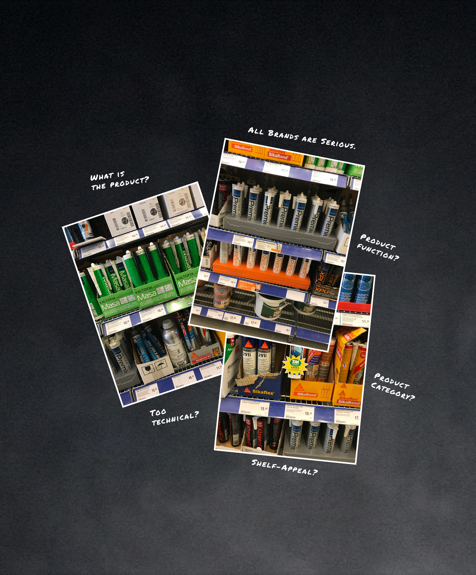
We began by analysing the adhesive market, where predictable design systems, dense technical language, and restrained colour palettes dominate. Most brands look and sound the same: serious, conservative, and overengineered. This uniformity revealed a clear opportunity to do something different.
Our research, shaped by our own experience working in construction when we were younger, pointed to a clear insight. Construction professionals value directness and a straightforward sense of humour. When used with honesty and purpose, this kind of humour does not undermine trust, it builds it. By pairing that tone with professionalism and reflecting how people actually speak on site, the brand turns a provocative name into a confident, credible promise construction workers can believe in.
The strategy was simple: earn attention on shelf without any other external gimmicks. WTF speaks clearly and directly, balancing boldness with authenticity, and humour with professionalism. The brand stands out by being human, self-aware, and relatable, positioning itself as a smart, dependable presence on site rather than a faceless industrial brand.
Concept and Execution
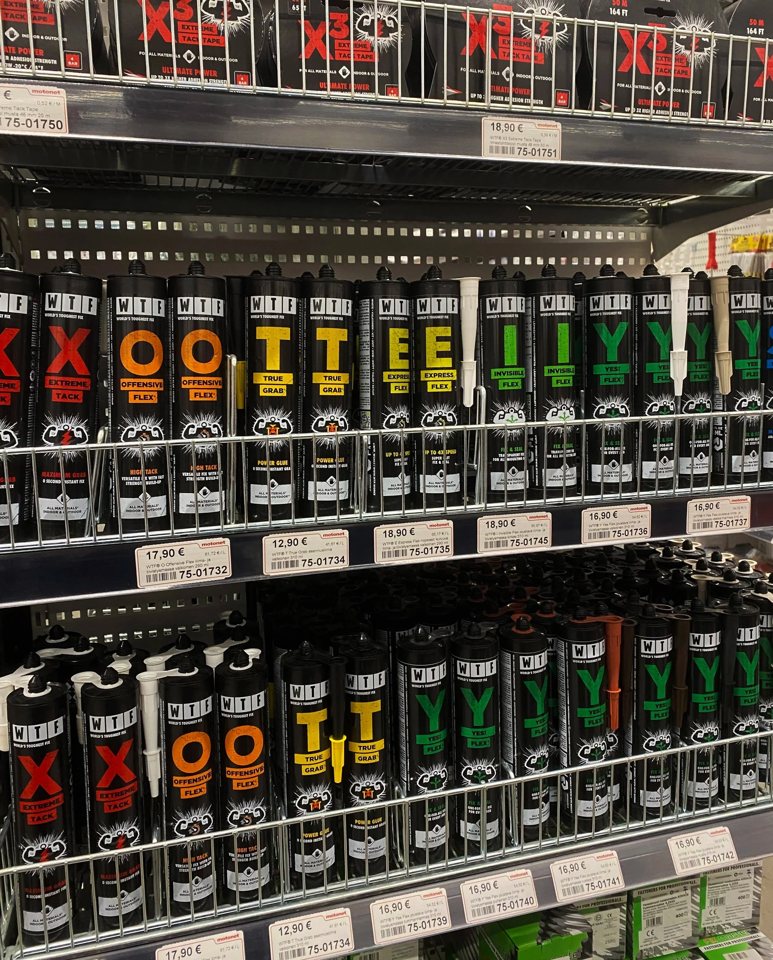
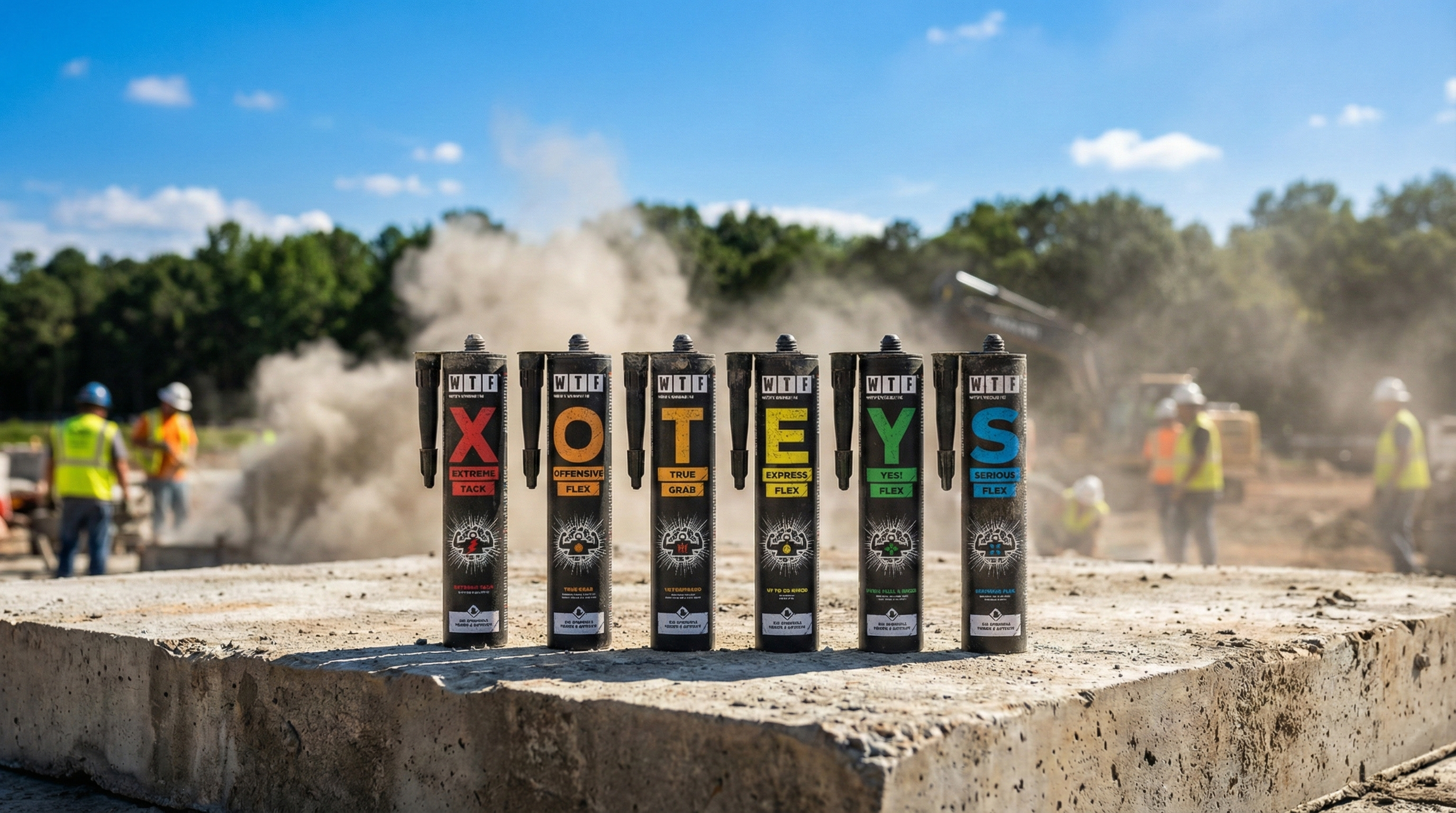
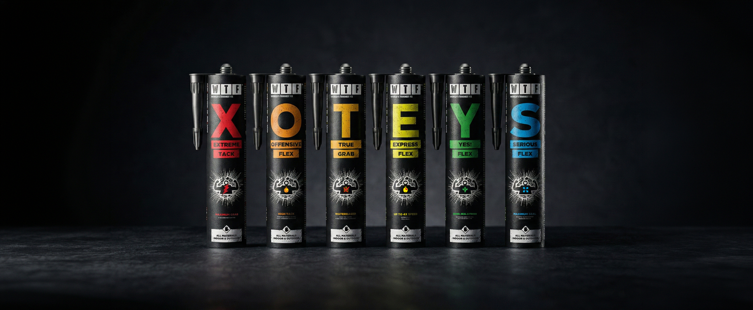
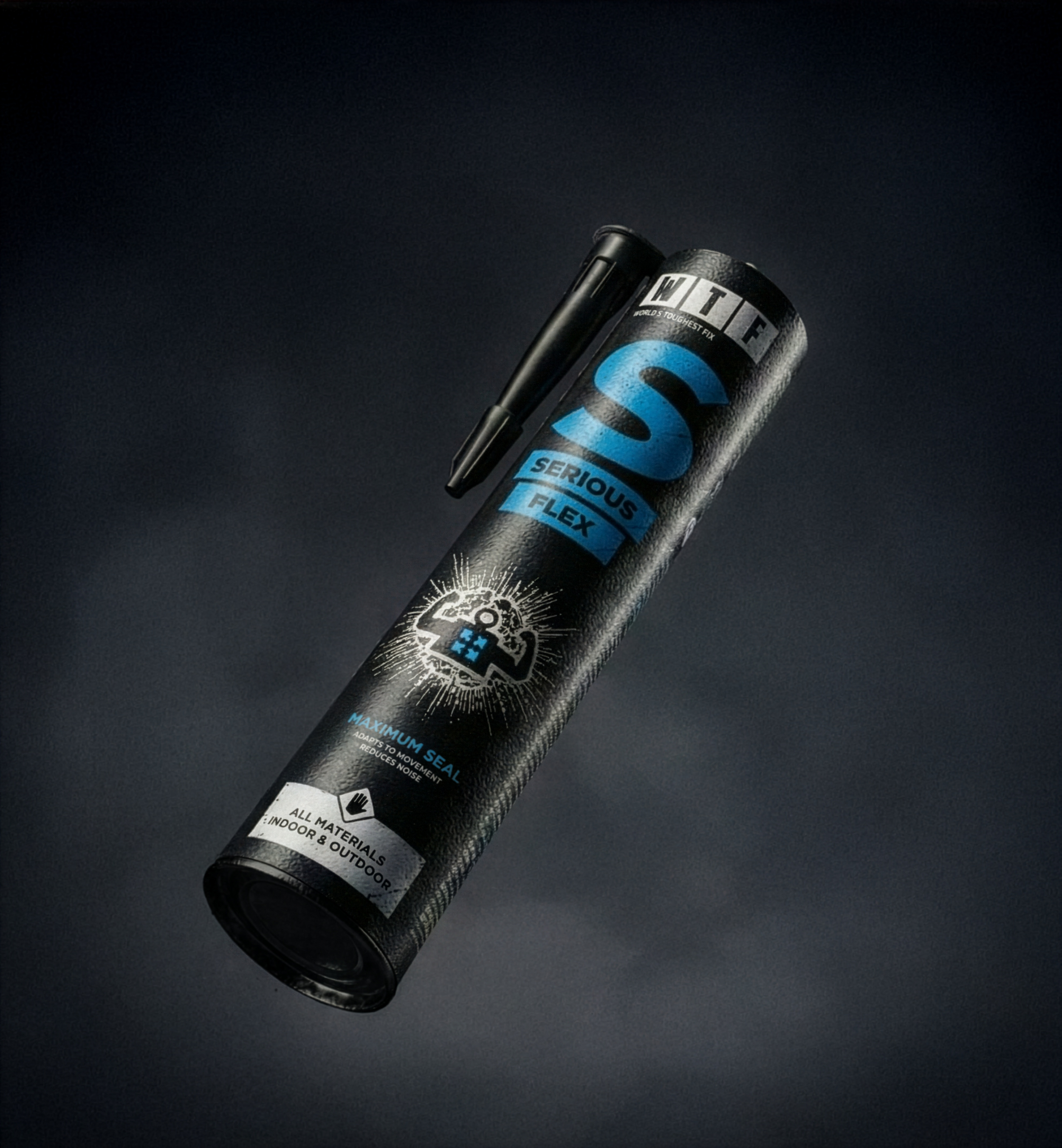
Packaging formed the foundation of the WTF brand identity. From the outset, the system was designed to be as bold and resilient as the name itself. Instead of relying on trendy typefaces or decorative visual language, the identity focuses on professionalism, durability, and clarity, aligning with both product performance and user expectations.
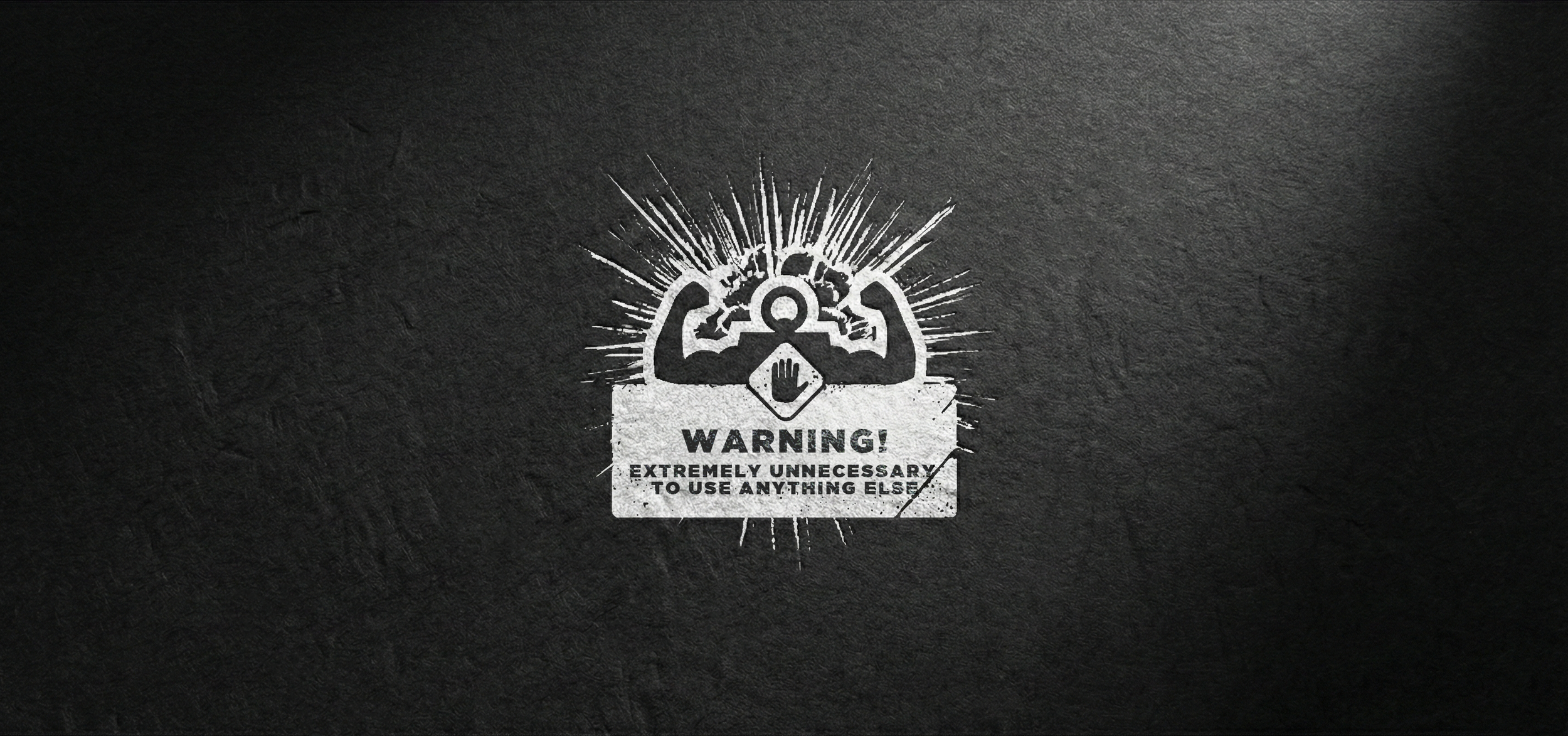
A strong wordmark anchors the brand and communicates wit through confidence rather than gimmicks. Subtle visual and verbal details support the personality without compromising credibility. Graphic elements take inspiration from construction-site aesthetics, introducing a controlled sense of roughness. This is balanced with clean layouts and a clear communication hierarchy, ensuring the design remains functional while allowing the brand to stand out on shelf.
The tone of voice follows a simple principle: direct, self-assured, and witty.
The brand was designed to be flexible across multiple adhesive and sealant types while maintaining a consistent visual language and clear on-pack communication. The final result balances humor with professional-feel, giving WTF a distinctive shelf presence and credibility in a category that often takes itself too seriously.
The WTF brand gained immediate attention after launch. It stood out in retail environments and generated discussion for its bold use of humour in a serious product category.
The project proved that even in technical markets, bold ideas can drive commercial success when grounded in real conviction. WTF turned a spontaneous creative idea into a credible brand with genuine impact.
Rakennuskemia proved that bravery in many markets are the key for success. WTF has become a reminder that when you trust a good idea and execute it well, bold really does stick.
Results