
Savon
Brand development:
Concept
Research & Insight
Communication
Visual Identity
Packaging Design
Adding Beauty
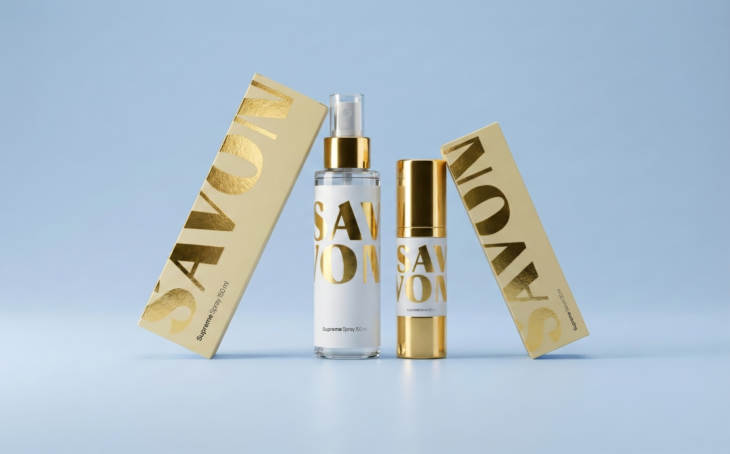
We helped Savon with their first-ever product line, by designing and developing their identity into packaging for make-up, skin-care, and hair.
Savon has long been known for their expertise within the cosmetics category and salon experience, but until now, they had never created products of their own. When the opportunity came to develop Savon’s first product range, the goal was to translate everything Savon stands for into physical form. A refined collection for make-up, skin-care, and hair, built to reflect the brand’s world through design.
Less Paradox worked closely with Savon to create a cohesive brand and packaging system that could extend across multiple categories while remaining unmistakably Savon.
Challenge
Savon’s identity had always lived in digital and spatial realms. This marked its first translation into a tangible product, something customers could hold, share, and experience firsthand.
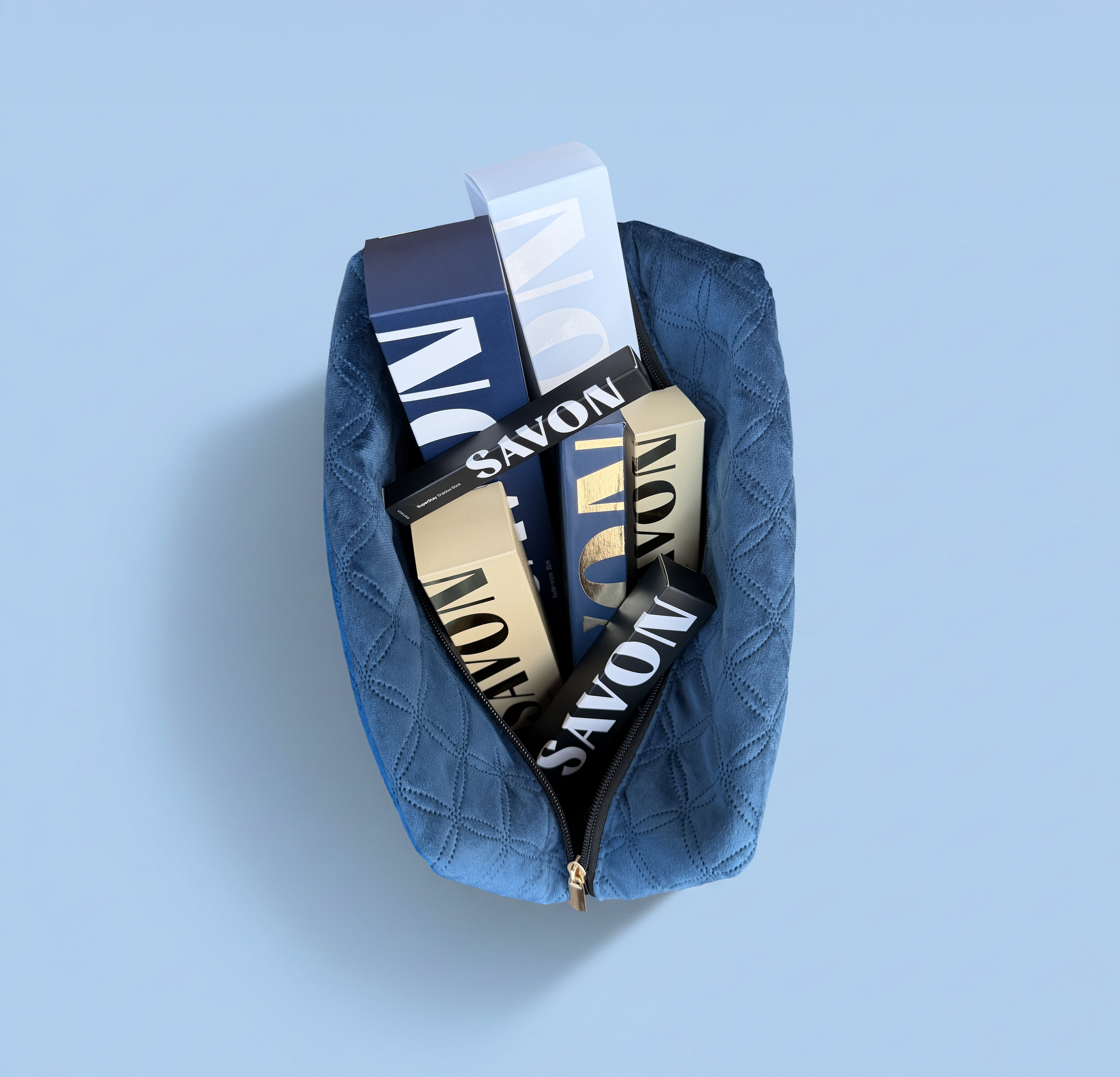
The products would only be sold through Savon’s own online store and salon network. Because of that, the packaging had to work beautifully in two worlds: it needed to create a strong impression in digital space and feel equally refined in real life.
Approach
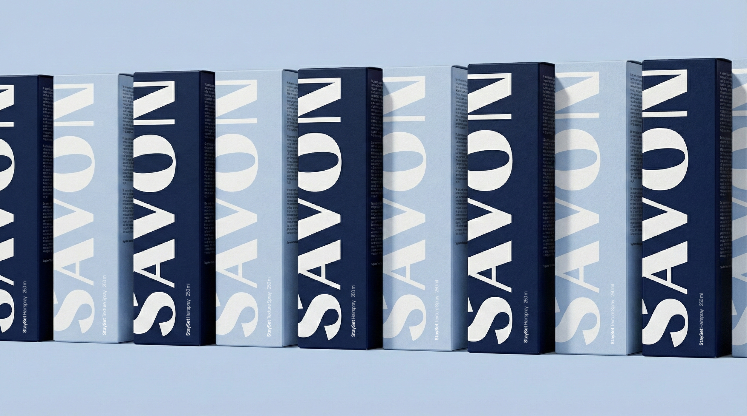
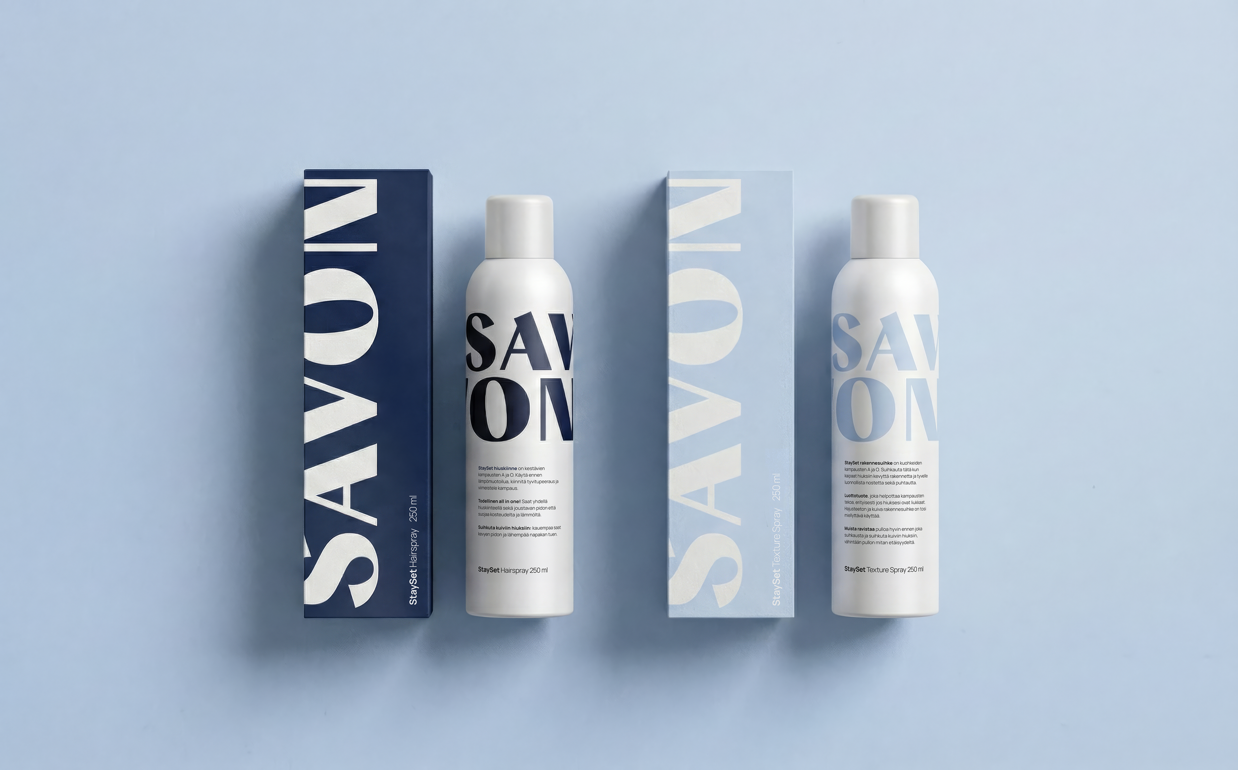
We designed a visual system that allowed flexibility between categories but maintained a consistent Savon tone. Color played a defining role, supported by clean typography and precise structure. The result is a visual language that feels timeless and bold while remaining true to Savon’s essence.
Each category, make-up, skin-care, and hair, was given its own tonal direction, allowing for individuality while still fitting seamlessly within a unified identity. The packaging became both functional and expressive, reflecting Savon’s attention to detail and aesthetic clarity.

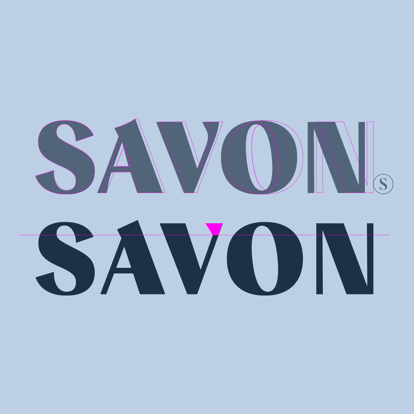
Tweaking the Visual Identity
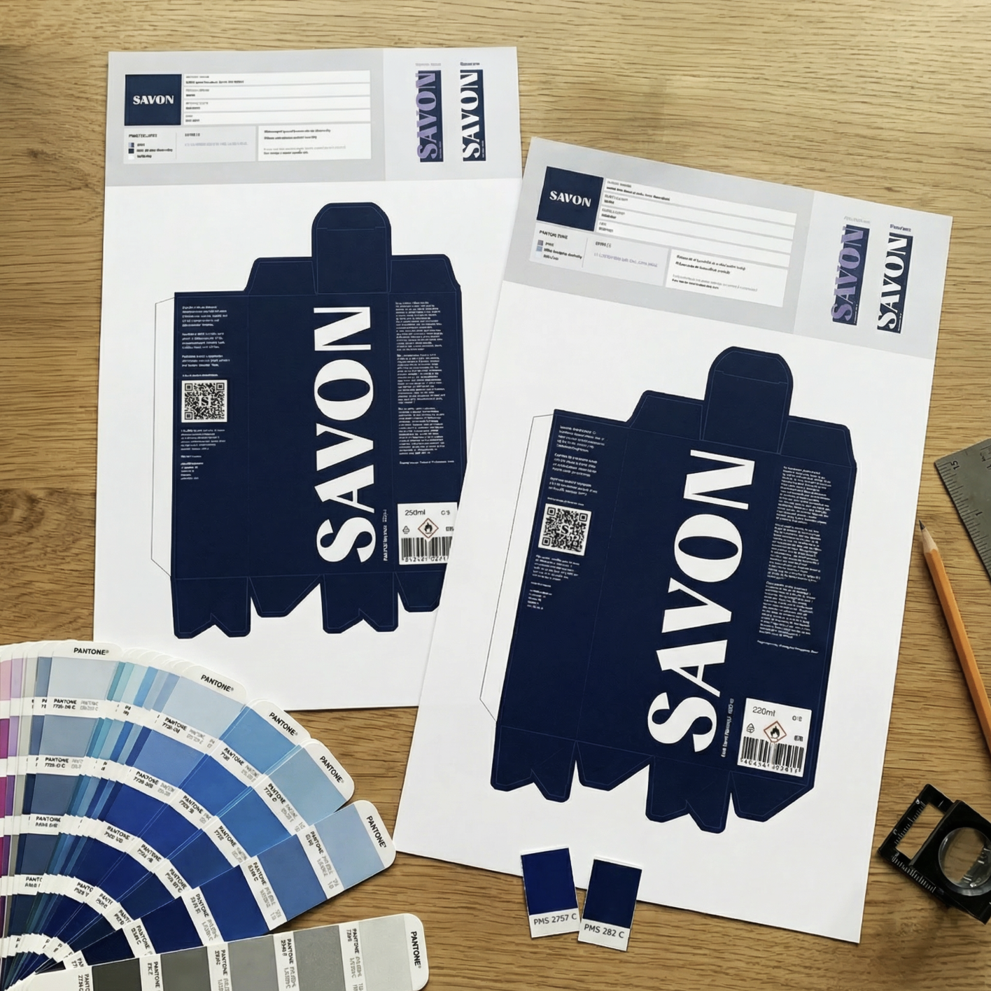
Together with Savon, we refined the brand’s visual identity to work more effectively on packaging.
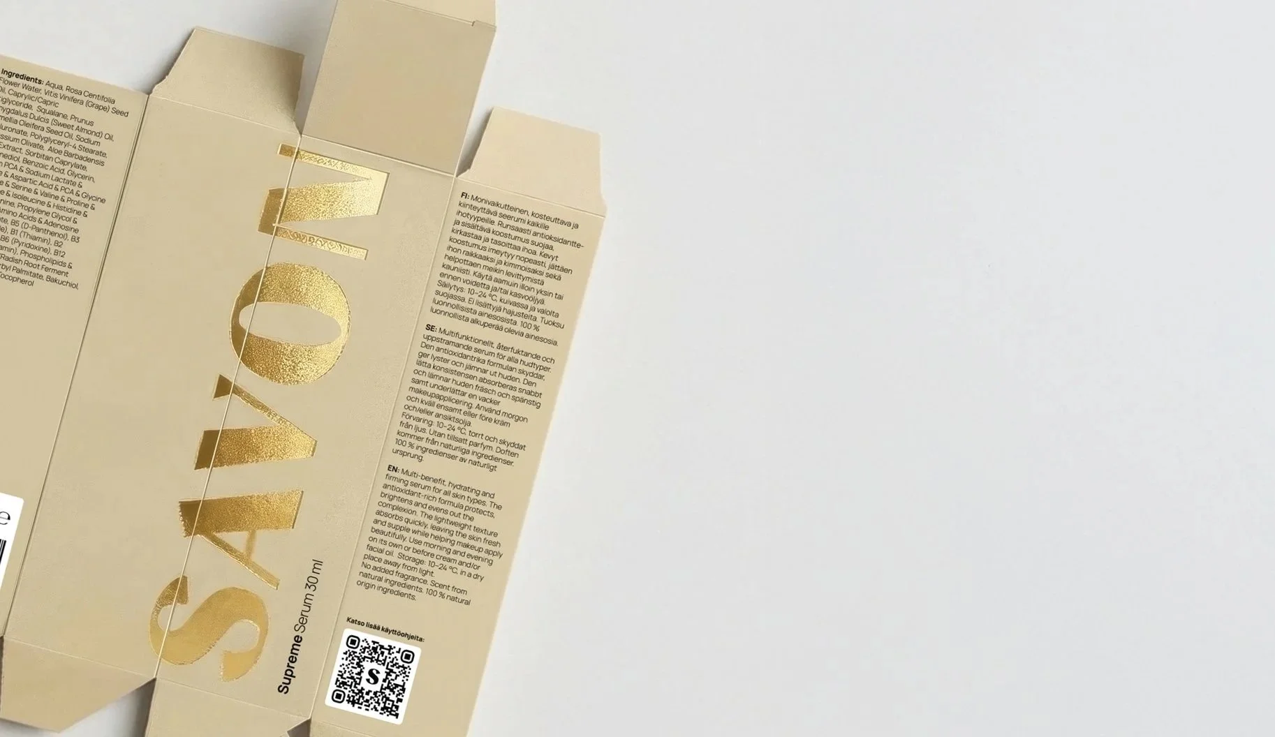
The logotype was updated by simplifying its form and removing curves from the original version. This made the logo appear more contemporary and confident. Straight, structured shapes were introduced to reinforce balance and give the mark a functional edge. Especially through the redefined “V”, we could easily determine how the logo would fold across packaging surfaces, adding both structure and function to the design. The kerning was also refined to allow the logo to breathe more naturally, enhancing compositional harmony.
Savon’s color palette was also renewed. While the brand had been associated with a muted blue, we developed a fresher and more modern color scheme that would better represent their future vision and translate strongly in digital contexts.
Typography of the body text was updated to improve readability and accessibility. The previous serif headline style was replaced with a clean, sans-serif font that enhances legibility while aligning with Savon’s minimal and modern aesthetic.
Results
The new product line was introduced as part of Savon’s annual Jouluboxi, a curated holiday box sold through the salon. Each year, the box is a surprise selection of products, and this time, for the first time, it featured Savon’s very own creations.
The launch marked a milestone for the brand, expanding its offering and strengthening its digital presence. The packaging now acts as a recognisable expression of Savon’s world and a object that not only represents the brand visually but also brings the Savon experience into the hands of its customers.
Savon Studio | Kati Mouhu | OwnerWhen we began developing our first-ever product range, I knew immediately that I wanted to bring Tony on board.
Tony had designed several beauty brands before, and I trusted his deep understanding of how to translate a brand’s essence into design.
Tony started by diving into our existing brand book and refining it to reflect how our business and audience had evolved. The process was about sharpening and strengthening, both visually and conceptually. We wanted our new identity and packaging to express one key word: strength. This was the moment to showcase our expertise through the products themselves, and Tony captured that perfectly.
The logo was refined, the color palette evolved to bring more power, and freshness, and every design decision was made to communicate confidence and authenticity, while staying true to our original DNA. The brand update was subtle yet distinctly new and invigorating.
Throughout the process, Tony was deeply involved, even in print house meetings, bringing invaluable insight and technical expertise. It became increasingly clear how experienced and thorough he is as a designer. Every suggestion he made was backed by a solid understanding of both creative direction and practical execution.
Working with Tony means working with someone who truly immerses himself in his client’s world. He brings bold, thoughtful ideas to the table, ideas that come from genuine expertise and a refined sense of brand positioning. Thanks to his vision, our new packaging has received exceptional feedback, and the brand now feels exactly as it should: strong, expert, and timeless.