
Järvikylä
Brand & Packaging development:
Research & Insight
Visual Identity
Communication
Packaging Design
Rooted in history & replanted for tomorrow.
Järvikylä is one of Finland’s most recognised producers of fresh herbs and salads. The brand’s roots go back to the 1600s, and the same family has nurtured the land for over four centuries. Known for its authenticity and care for nature, Järvikylä has become a trusted name in Finnish households.
As the company made the shift from plastic pots to biodegradable materials, it also recognised the need to refresh its brand. The new direction needed to celebrate Järvikylä’s long history while reflecting its modern sustainability goals.
We were invited to help shape this transition and create a new visual identity, communication and packaging for a more environmentally aware future.

Challenge
Many people didn’t realize that Järvikylä is a real place, with a historic mansion and a long farming tradition. This created a challenge: how could we make the brand feel authentic and rooted in its true heritage, instead of something imagined or artificial like many generic brands?
Another important question was how much should we actually redesign. In many rebranding projects, the hardest part is finding the right balance between change and continuity. For Järvikylä, it wasn’t about making a radical shift. It was about refreshing and strengthening what already worked, and improving what didn’t.
The main goal was to evolve Järvikylä’s identity so it remained faithful to its history while also reflecting a forward-looking, sustainable future. The existing branding no longer captured the company’s energy or its leadership in sustainable cultivation.
With more than 80 products on the market, we also needed to bring clarity, consistency, and recognisability to the packaging system. The new identity had to be simple, human, and distinctly Järvikylä, telling a story of both legacy and renewal.


Approach Questions
How can we express a four-hundred-year heritage in a way that feels contemporary and alive?
What role should the family’s story play in building authenticity and trust?
How can packaging design bring greater clarity on the shelf while creating a stronger emotional connection with consumers?
Outcome
Insight: People don’t just buy herbs. They buy into the values, dedication, and care of the people who grow them, and they are drawn to packaging that reflects those same qualities through thoughtful design.
Positioning: Freshly grown heritage. A family-owned Finnish brand that grows with respect for nature and for the people who enjoy its produce.
Brand Personality: Honest, caring, and genuine. Järvikylä reflects the spirit of Finnish simplicity, expressed through craft, integrity, and attention to detail.
Communication Strategy: The phrase “Kasvatettu sinulle” (“Grown for you”) became a central message, conveying warmth and a personal bond between company and consumer.
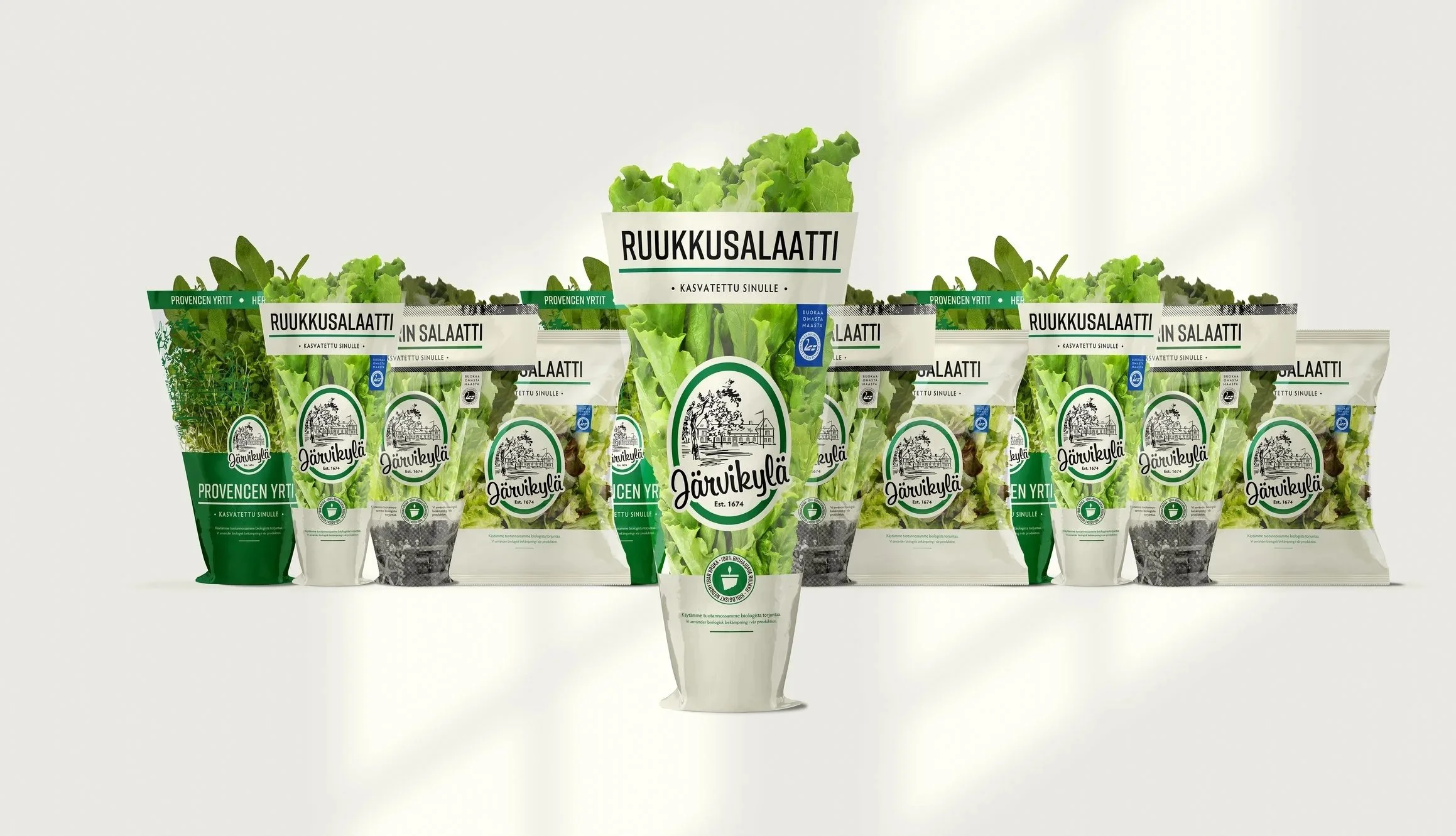
Packaging Design: The packaging was redesigned to highlight freshness and authenticity while ensuring clarity across a wide product range. Clean typography, natural color tones, and heritage-inspired details create a consistent look that feels both modern and rooted in tradition.

Concept & Visual Identity
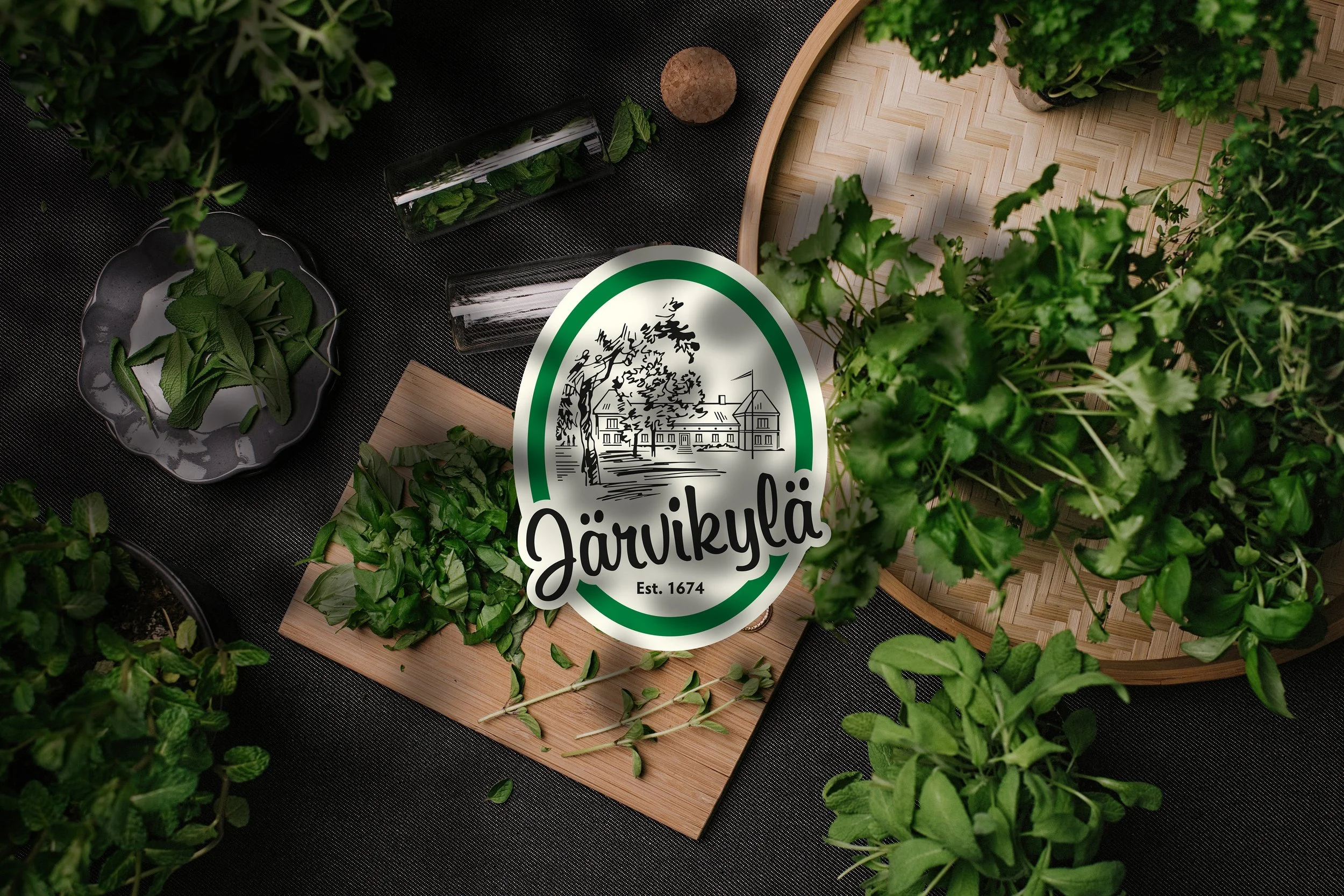
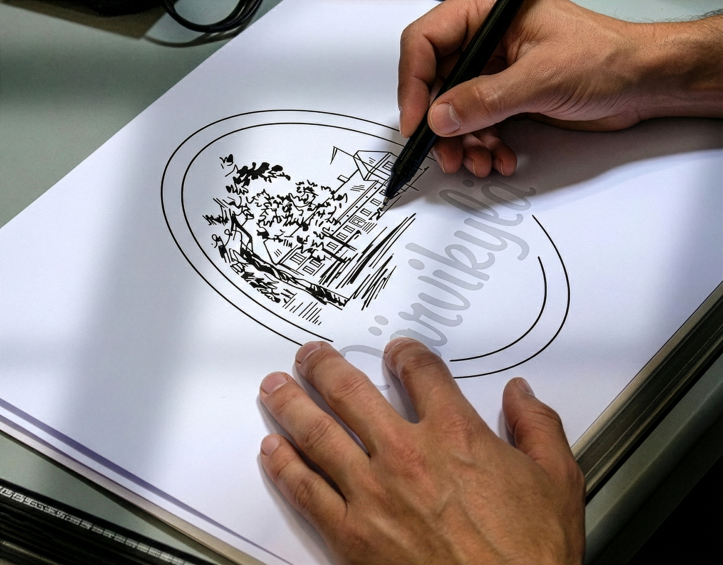
The new identity was inspired by the Järvikylä history and estate itself. The updated logo features a refined illustration of the historic mansion, now accompanied by the new generation of family members to mark a new era.
The logo was redrawn to work in a single colour for flexibility and consistency across media. The logotype was adjusted for better legibility at small sizes, and the overall system was simplified to feel more confident and clean.
A brighter, more natural colour palette replaced the old dark green. The new white background allows the fresh greens of the herbs to stand out, while a modern typographic system adds clarity and approachability.


Communication
For Järvikylä, communication focused on revealing the real story behind the brand: a genuine place, a family, and a long heritage of growing with care.
The message “Kasvatettu sinulle” (“Grown for you”) became the voice of the brand, expressing warmth and a personal connection between grower and consumer. It is not just a slogan, but a sincere promise that reflects genuine care.
The tone is honest, calm, and human. Visual storytelling builds on the same idea, showing real people, real places, and natural light that reflects the simplicity and integrity of Finnish life.
Across packaging, digital, and in-store touchpoints, the identity and communication work together as one system. Clarity, consistency, and emotion combine to make Järvikylä both recognisable and relatable.


Packaging design & storytelling
Järvikylä’s packaging had remained largely unchanged across its wide product range, and it no longer reflected the brand’s evolving story or values. Product names were not always easy to read, and the logo felt overly detailed, with too many elements competing for attention. The colours also failed to reflect the freshness that consumers experienced in-store. As a result, the brand’s story of family, care, and sustainability often went unnoticed.
The new design brought unity and clarity. It rolled out across more than 80 products, it introduced clear naming, refined typography, and a strong visual hierarchy for easier recognition on shelf.
The phrase “Kasvatettu sinulle” (“Grown for you”) beneath each product name adds a personal touch and reminds consumers of the care behind every herb. Natural imagery, a simplified logo, and an more natural/fresh colour palette connect the brand back to its real origin, the historic Järvikylä estate.
The result is packaging that feels fresh and consistent, reflecting the brand’s story of growth and heritage.


Shelf-Ready Packaging
In addition to product packaging, we designed a new shelf-ready packaging system for Järvikylä. The goal was to create transport and display boxes that not only worked functionally in logistics but also looked fresh and inviting on the retail store floor.
We transformed the SRP it into an active part of the brand experience. The updated design features clear branding, unified colours, and improved product visibility to help consumers immediately recognise Järvikylä in-store.
By refining the design, we made it clearer for retailers to handle, while reducing material waste and improving stacking efficiency. The result is packaging that serves both people and purpose — practical for stores, appealing for consumers, and fully aligned with the Järvikylä brand identity.


Results
The refreshed Järvikylä identity was warmly received by both consumers and retail partners. The new design improved shelf visibility and strengthened brand recognition. Feedback highlighted the clarity of the packaging and the warmth of the communication.
Most importantly, the new identity gave the Järvikylä family a renewed sense of pride. Their story now feels visually alive and perfectly aligned with the brand’s mission to grow responsibly for future generations.
In essence, We helped Järvikylä reconnect with its roots while stepping confidently into a sustainable future. The result is a brand that feels both enduring and refreshingly new.