
King Konjak
Brand development:
Research & Insight
Brand Strategy
Visual Identity
Communication
Marketing
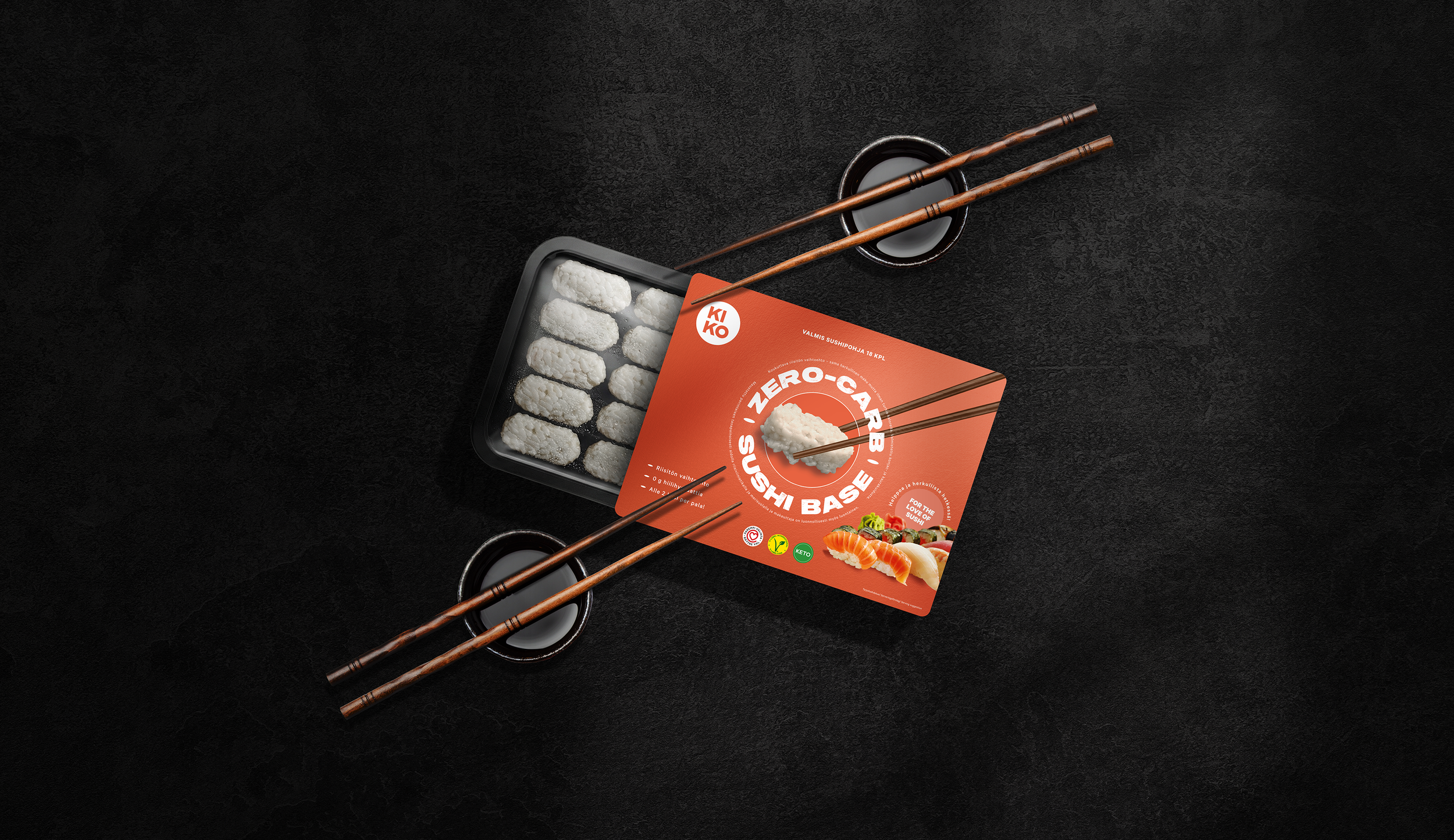
Packaging Design
Marketing Tools
Redefining the Sushi Experience
King Konjak is a Finnish food innovation brand on a mission to make sushi lighter, healthier and more sustainable. The company created the world’s first ready-made sushi base made from konjac, a natural plant root known for its low calories, high fibre and unique ability to absorb flavours while maintaining a satisfying texture similar to rice.
For modern consumers seeking balance between indulgence and wellbeing, konjac offers a smart alternative to traditional sushi rice. King Konjak partnered with us to bring this groundbreaking idea to life through a distinctive brand identity and clear, appealing communication that introduced the concept to both retailers and consumers.

Challenge
As an entirely new category, King Konjak faced the dual challenge of explaining what the product is and why it matters. There was no existing benchmark or visual language for a sushi base made from konjac.
The brief was to design a brand that could stand out immediately on shelf, quickly communicate the product’s benefits and spark curiosity among consumers unfamiliar with konjac.
In short, we needed to make an unseen product feel both exciting and understandable. The task was to turn innovation into attraction, within the limited space of a retail pack and across digital channels.


Strategy and Research
The project began with in-depth research into the category landscape, including sushi, healthy convenience foods and plant-based innovations. Our research revealed a familiar pattern: most brands relied on minimalistic design, muted colour palettes and carefully restrained communication.
This insight uncovered a clear opportunity for King Konjak to stand apart. Instead of blending into the visual codes of health food, we set out to create something that felt fresh, energetic, modern and full of confidence.
We collaborated closely with the client to understand their ambitions and to define the emotional territory of the brand. King Konjak would not be a quiet health product. It would be a bold challenger with something genuinely new to say, and a distinctive way of saying it.


Strategic Questions
How can we introduce a completely new food concept without overwhelming the consumer?
What visual and verbal cues help build trust while maintaining a sense of excitement?
How can a small shelf presence deliver a strong impact and communicate both innovation and taste?
Strategic Outcome
Insight: People are curious about innovation in food, but they need clarity to feel confident trying something new.
Positioning: King Konjak is redefining sushi for modern tastes, offering a fresh, innovative and sustainable twist on a beloved classic. It is not about being a health brand, but about creating a smarter, lighter way to enjoy sushi without compromise.
Brand Personality: Bold, modern and a little bit playful. Confident enough to stand out in the chilled aisle but grounded in quality and health.
Communication Strategy: Focus on clarity first, curiosity second. Every element of communication should explain the concept quickly and leave a lasting impression through tone, colour and energy.


Visual Identity & communication
The visual identity was designed to express freshness and innovation while staying true to the Japanese-inspired origins of the product. The logo highlights a crown symbol that reinforces the brand’s confident name and premium positioning.
The colour palette balances bold energy with natural freshness. Inspired by sushi, it plays with vibrant salmon tones and clean rice whites, contrasted with modern neutrals for balance and versatility. This mix creates strong shelf impact and a sense of innovation while staying approachable and appetising.
The main message was centred around the hero image, surrounding it with the key product story, benefits and claims. This approach keeps communication clear and visually driven, highlighting a simple idea, a new way to make sushi that’s better for you and the planet.


Execution
We developed the complete brand identity and packaging design system for the product range, ensuring flexibility for future SKUs. The packaging structure balances storytelling and function, allowing the product to stand out while clearly explaining how it works.
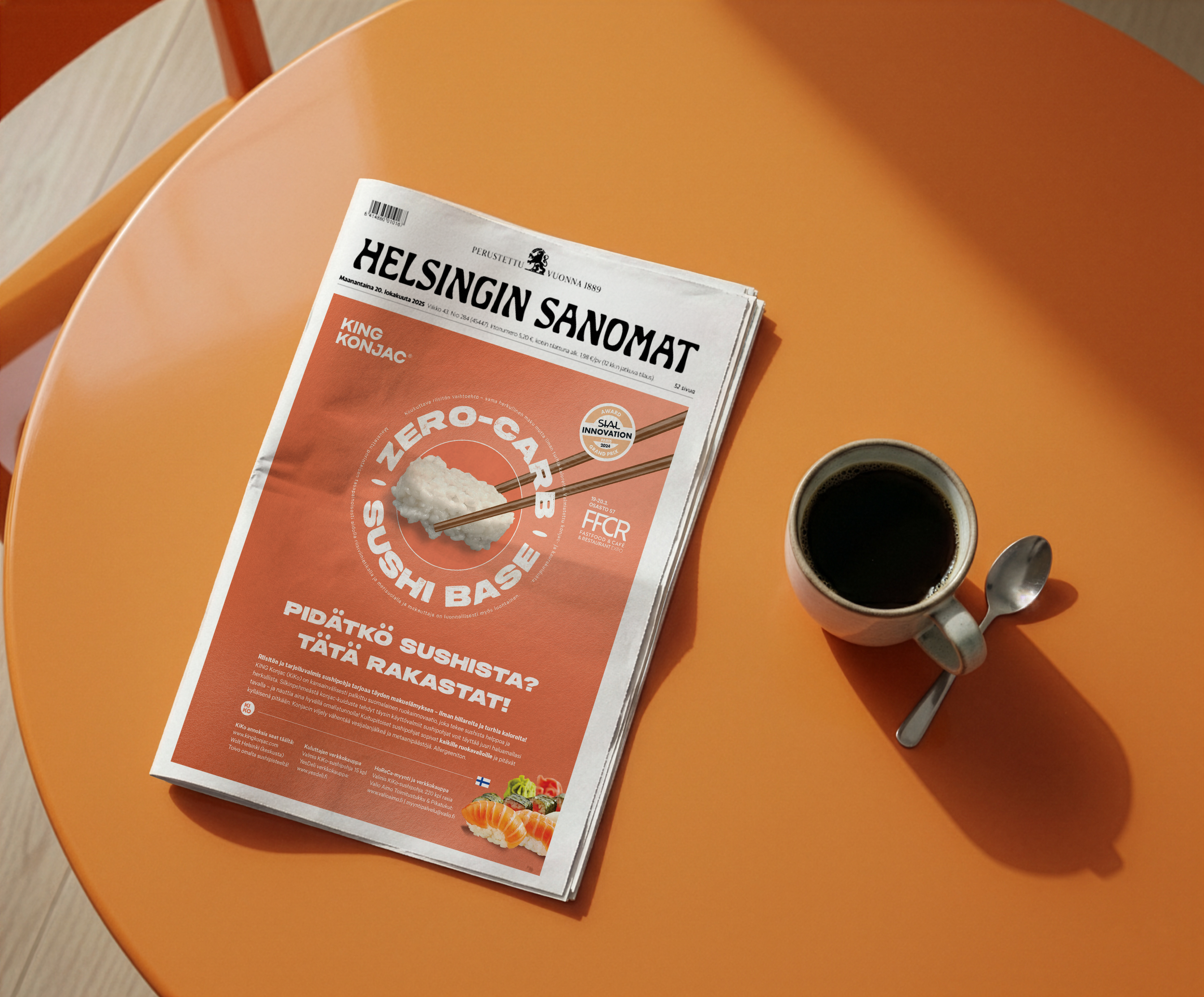
Beyond packaging, we designed communication materials for both retail and digital use, including advertising for Helsingin Sanomat. These assets helped introduce the brand to the Finnish market.
To empower the client’s internal team, we also created marketing templates and tools so that King Konjak could manage its day-to-day marketing activities independently. The result was a scalable system built to evolve as the brand grows.
Results
King Konjak launched successfully with strong recognition for its innovation and striking shelf presence. Retailers appreciated the clarity and visual distinctiveness, while consumers responded positively to the brand’s freshness and curiosity-driven tone.
The project helped position King Konjak as a pioneer in the plant-based food market, with an identity that reflects both its boldness and its integrity. The collaboration demonstrated how thoughtful design and clear strategy can make an entirely new concept feel both accessible and desirable.
A small product with a big story, designed to stand out, inform and inspire.
