

The Silent Finn
Brand Development:
Product development
Brand Strategy
Naming
Visual Identity
Communication
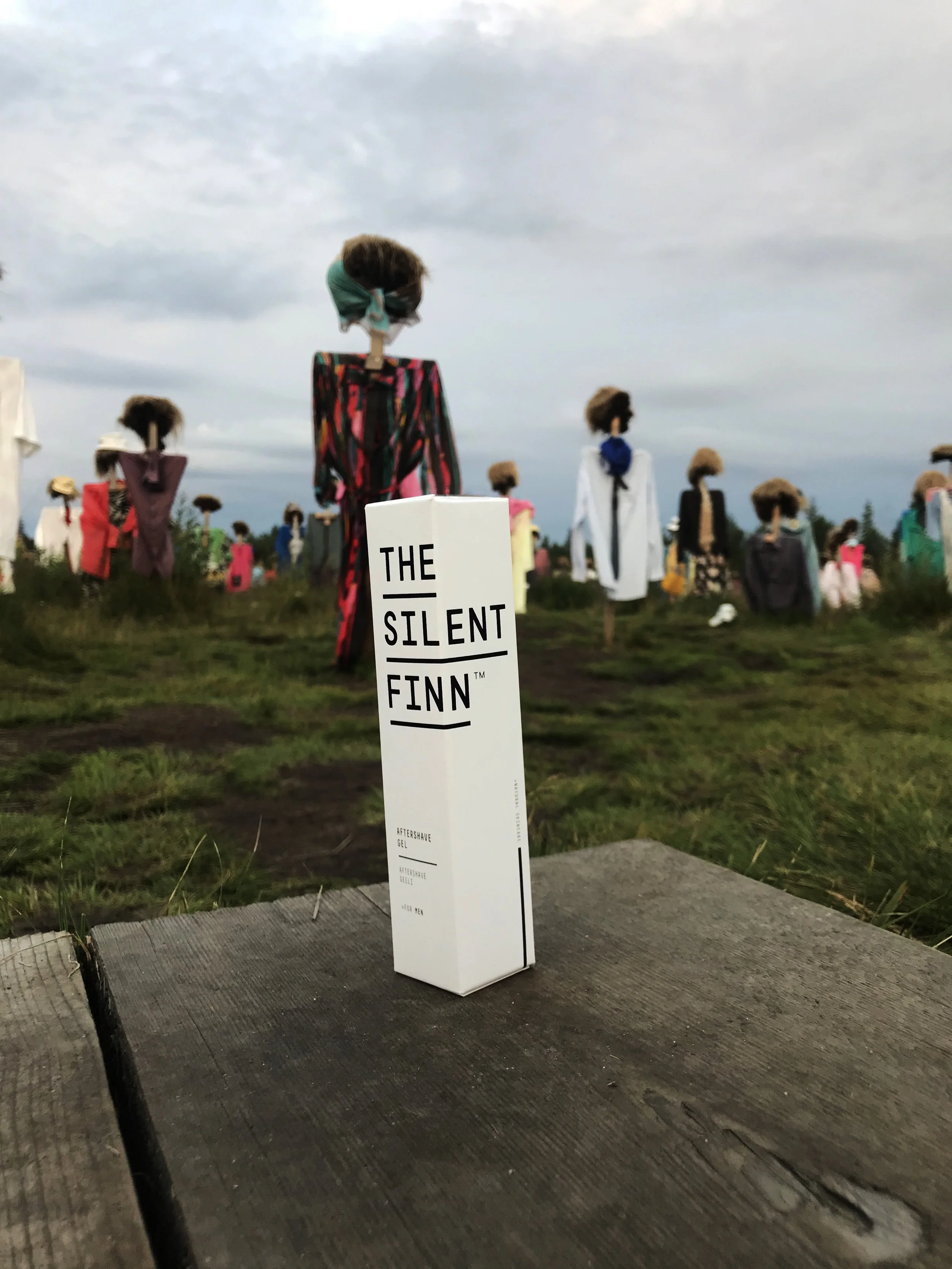
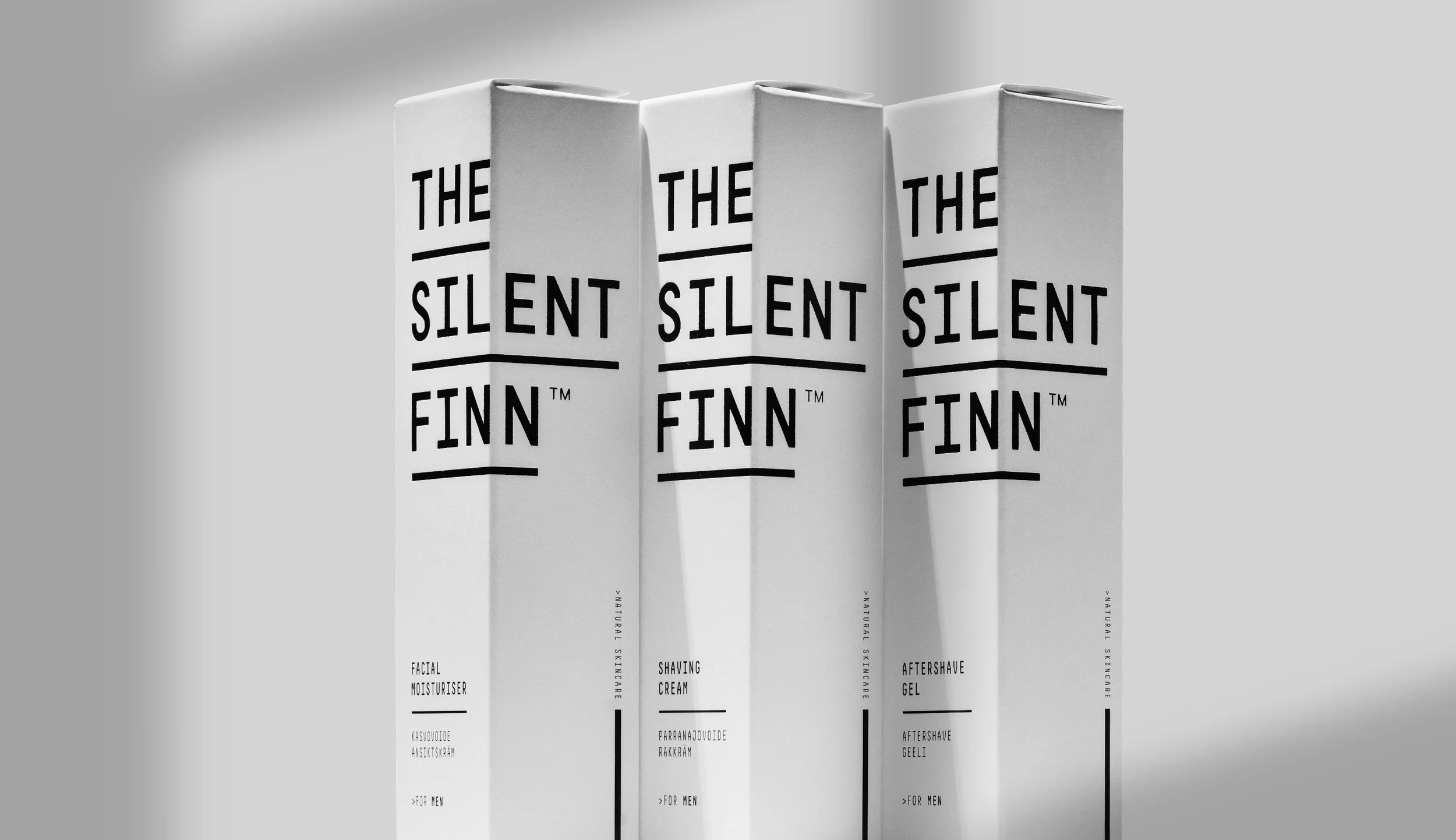
Packaging Design
Photos: Tuukka Koski / Koski Syväri
A refuge in a noisy world
The Silent Finn- skincare range was created that truly works for men’s skin, and to perform in every season of the Nordic climate. The range featured four essential items, collaboratively developed with cosmetics professionals: aftershave, face wash, shaving cream, and facial moisturizer. Our aim was to build a brand with its own clear voice and visual identity that feels authentic, distinctive, and rooted in Finnish simplicity and strength.
The main challenges:
Develop the products in collaboration with cosmetic experts to ensure quality, effectiveness, and suitability for all Nordic seasons.
Develop a skincare brand for men that feels authentic and not overly complicated.
Come up with a brand name that captures Finnish/Nordic character.
Define a clear market position that provides a strong competitive edge and supports marketing efforts.
Design packaging that stands out both in digital and physical spaces and attracts attention.
Create and launch four products (aftershave, face wash, shaving cream, and face moisturizer) with a unified brand language.

Product Development
We wanted to develop a simple range of products that would make it easier for men to adapt to using skincare as part of their daily routine. The products needed to feel natural, effective and true to their Nordic origin. Working closely with cosmetic experts, we focused on creating formulations that perform in every season of the Finnish climate while remaining gentle on the skin.
The key ingredient in all products was birch starch (Betula), derived from Finland’s national tree. Birch starch provided natural soothing and anti-inflammatory properties that help calm the skin after shaving and protect it from dryness and irritation. It also connected the products directly to Finnish nature, reinforcing the brand’s authenticity and sense of place.
Each formula was designed to be clean, simple and functional, mirroring the brand’s visual and verbal identity: effective without excess and rooted in nature without making it a gimmick.


Strategy
To resonate with Finland's roots, we entrusted the brand name to carry the narrative. "The Silent Finn" embodies the quintessential Finnish man stereotype, aligning perfectly with our products that soothe and "silence" the skin. This resonant name encapsulates the essence of Finnish men and the product's calming impact. This approach materialized from the concept of "silent" communication, allowing us to unlock numerous interpretations that formed a cohesive “silent” visual and, short to-the-point verbal communication. This approach provided clarity on our brand's image and communication channels.
This idea grew into a broader concept of "silent" communication, guiding the brand’s visual and verbal identity. We set out to make photography and video the main focus of expression, as communicating silence required atmosphere, emotion and presence rather than words.
Strategic Questions:
We wanted to dig deeper into what silence could really mean, and how we could make the brand truly own that word. What does silence look like, sound like, and feel like when it becomes part of a brand’s personality? These questions helped us define how The Silent Finn should speak, look, and behave.
How does silence behave as a brand?
– What emotions does it evoke?
– How can “quiet” feel powerful rather than passive?How does silence speak visually?
– What defines visual silence?
– How can we make emptiness feel intentional, not empty?What does a Finnish silence look and feel like?
– How can we reference Finnish identity without resorting to national and nordic clichés?How do we communicate with minimal words?
– How do we craft a tone of voice that is reserved, confident yet humble (Stereotypical Finnish male)?
– What’s the minimum amount of language needed to express meaning and integrity?What does “silent” luxury mean for men?
– What is luxury for our core audience?
– How do we design for feeling rather than for attention?What does “silent” mean in packaging design?
– How can layout, communication, materials, finishes, and structure express restraint and quality simultaneously?How do we ensure consistency across all touchpoints?
– How can the same sense of calm and clarity exist in packaging, web design, photography, and copywriting?
– What are the visual and tonal boundaries that define “too loud”?


Approach:
Our strategy positioned The Silent Finn as an antidote to digital fatigue, a brand that offers calm and the luxury of one’s own time in a world filled with constant noise and distractions. By redefining silence as a form of strength and care, the brand connects deeply with a growing desire for rest, simplicity and authenticity.
Positioning: Claim your own time
It’s about reclaiming your time from the endless pull of people, algorithms and constant demands that compete for your attention every waking moment. In a world that rewards speed, visibility and constant engagement, The Silent Finn celebrates the quiet act of stepping away. It’s about choosing when to connect and when to disconnect, giving yourself permission to slow down, reflect and simply be. Because true luxury today isn’t about expensive or shiny things, it’s about owning your time, doing what you genuinely enjoy on your own, or allowing yourself the rare freedom to do absolutely nothing at all.
Brand Personality: Quiet strength
The Silent Finn embodies calm confidence and grounded authenticity. It speaks softly but with purpose, choosing clarity over noise and honesty over exaggeration. There is no rush or performance, just quiet conviction and care in everything it does.
It feels human, steady and reassuring, like a trusted companion that values presence over perfection. Rooted in Finnish simplicity, The Silent Finn reminds us that true strength lies in calmness, and that stillness can be its own form of power.
Brand Communication: Honest simplicity
The Silent Finn communicates with quiet confidence, clarity and purpose. Every message is deliberate, to the point and free from nonsense. The tone is calm, sincere and human, giving space rather than filling it with noise.
In a time when consumers feel overstimulated and overwhelmed, The Silent Finn would stand for stillness. With its communication, the brand encourages people to take a break from digital distractions, even from our own channels, and we commit to doing the same. Visual and verbal elements work together to reflect balance and presence, using minimal design and carefully chosen words to invite calm, reflection and genuine connection.
A Refuge from the Noise
The strategy also aligned with broader shifts toward “rest and time for only you”. Instead of competing for attention and constant chase for success. The brand invites reflection, instead of promising change and it delivers relief. This approach reframed skincare from a cosmetic ritual into an act of quiet self-care, offering consumers a sense of grounded luxury, something they can feel, not just see.
By anchoring the brand around this emotional truth, The Silent Finn became more than a skincare line. It became a avant-guard of calm confidence and modern Finnish resilience. A silent refuge in a noisy world.


Visual Identity & Packaging
The visual identity was created to express The Silent Finn’s sense of calm strength, authenticity, and refined simplicity. Every element was designed to feel confident without being loud, honest, minimal, and unmistakably Finnish.Logo & Typography: Approachable custom typeface, with bold, modern forms, and structure.
Logo & Typography:
A clean, contemporary wordmark with balanced proportions and subtle character, paired with minimal sans-serif typography. Together they communicate precision, calmness, and quiet confidence.Color Palette:
Neutral tones of black, white, and soft grey, supported by muted natural shades. The palette reflects Nordic restraint and creates a sense of stillness.Graphic Elements:
Simple geometric shapes, refined lines, and open layouts create rhythm and space. Every detail supports the brand’s silent visual language, nothing extra, only what matters.Photography Style:
The imagery centres on men, materials, surfaces and atmosphere, capturing the quiet essence of Finnish authenticity. Product photography highlights simplicity and honesty through careful attention to form, texture and detail, allowing the products to speak for themselves. Lifestyle imagery portrays men in calm, unhurried moments, surrounded by natural light and subdued tones. Together, they create a visual world that feels grounded, contemplative and real.

Verbal Identity & communication
The verbal identity was developed to reflect the same principles: restrained, direct and sincere. The brand speaks with intention, valuing substance over noise. There are no loud sales promotions or exaggerated claims, only honest and considered communication that respects the audience’s time and intelligence.

Tone of voice: calm, confident and human, combining expertise with empathy. It translates technical knowledge into clear, relatable language that feels genuine and approachable, building trust through honesty rather than persuasion. The Silent Finn embraces small imperfections, understanding that a typo or rough edge is not a flaw but a quiet reminder that there is a real person behind the words.
Communication: focused on honesty and genuine connection. It highlights everyday practicality and the importance of taking time for yourself through simple, meaningful messages that feel relatable and real. The Silent Finn communicates with calm confidence across all touchpoints, creating space instead of noise and encouraging moments of reflection rather than reaction.

Silence Became a Strength
The Silent Finn established itself as a calm, confident voice in the men’s skincare market. Within the first month, the brand entered 20 retail stores, which was a strong achievement for a niche segment without major chain distribution.
The design gained international attention through awards, design blogs and editorial features, generating valuable earned media that expanded the brand’s reach far beyond its original market. It proved that The Silent Finn was more than just a skincare line, becoming a quiet counterpoint to an increasingly noisy world.
The unified strategy, design system, and packaging gave The Silent Finn a clear direction and recognizable visual language. This consistency strengthened retailer trust and consumer recognition while helping the brand communicate seamlessly across digital and physical channels.
Capturing Finnish authenticity from A true and another angle, the brand built a strong and balanced presence both in-store and online. A clear strategy and cohesive design system established trust, consistency and recognition across every touchpoint, translating the quiet strength of Finnish design into a modern, approachable identity.
The project positioned The Silent Finn not just as a skincare brand, but as a modern interpretation of Finnish values: understated, precise, and quietly confident.
